Watch Our Product Tour
See how BigCommerce helps you build and manage your online store with ease.
- Ecommerce Insights

6 Key Steps to Launch Your Online Store
Explore our Launch Foundations series to get your BigCommerce store up and running quickly.
BigCommerce helps growing businesses, enterprise brands, and everything in-between sell more online.
7 Reasons Why Shoppers Aren't Converting on Your Website (And What You Can Do About It)
You can have the best-looking online store with the coolest landing pages and the most attractive images of your product — but if you’re not getting visitors to complete the goal you want them to (whether that’s a purchase or an email signup), all that design effort goes to waste.
If that’s the case, we urge you to do some research, come up with a hypothesis, and run a few tests to see if you can identify what’s stopping people from getting to the finish line.
These seven reasons are a good place to start looking:
1. They Don’t Understand What They Should Do
If you want people to sign up for your newsletter, but you haven’t included a CTA specifically telling them to do so, then you’re not going to get many signups.
If you haven’t included an easy way to add items to a cart or to check out, people aren’t going to make a purchase.
You aren’t being rude by telling people what to do. People need to know what to do when they get to your site. When you make the path clear, your website visitors will follow it.
Look at ModCloth’s homepage.
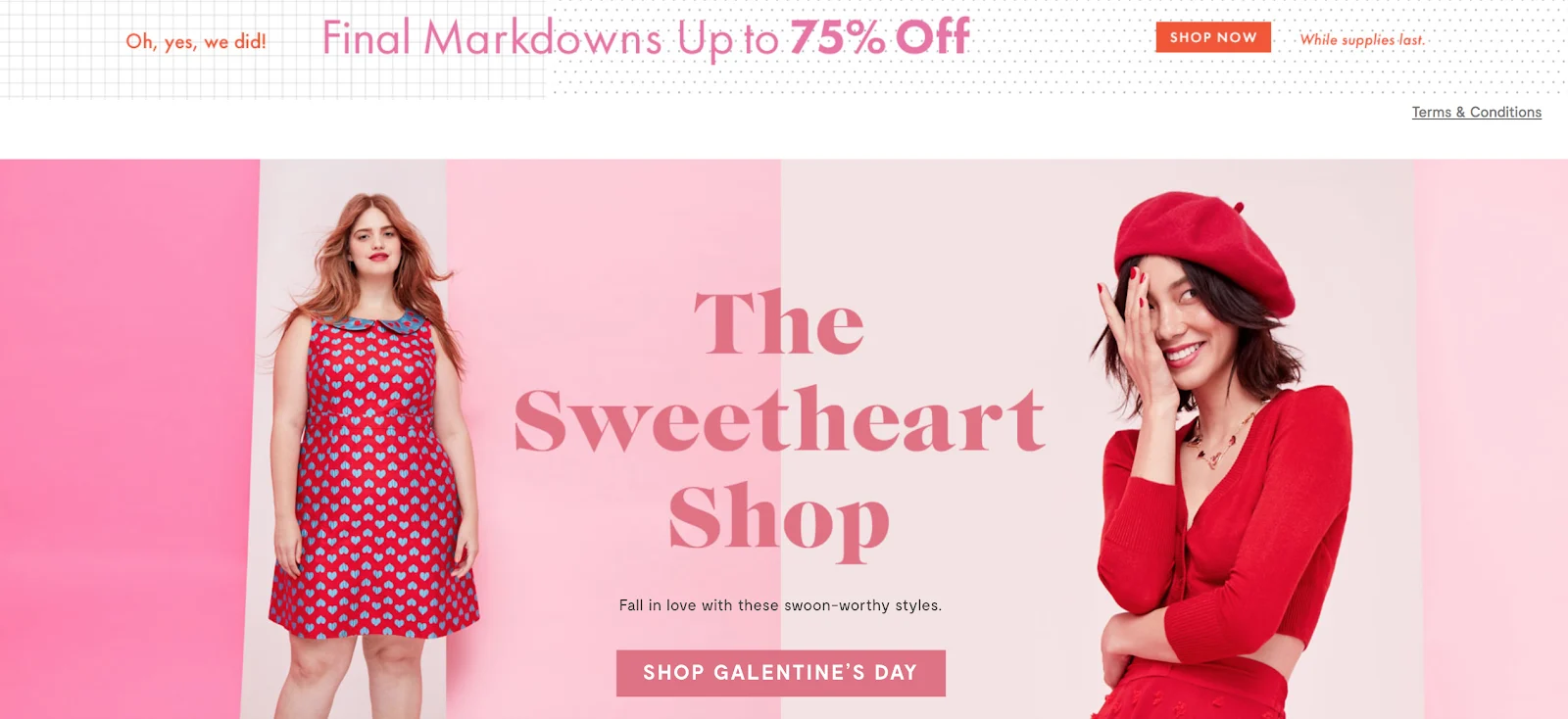
Right away the content is eye catching and seasonally appropriate. You see a sale promotion, and just enough of a description on a product line to want to click through.
Both CTA buttons include the word “Shop.”
That’s not by accident.
According to HubSpot, specific CTAs perform 202 percent better than generic ones.
Now look at a blog post, something a visitor would find through organic search.

For those who may just be discovering ModCloth, the company’s aim is to get new visitors signing up for their email list and receiving offers.
These CTAs use a similar color palette and concise copy to make it very clear what the next step should be.
2. They’re Lost
Amazon dominates the retail space, and has dictated what shoppers expect to see on ecommerce sites.
Over the years they have built a clear, intuitive structure that makes it easy for people to navigate and get to what they’re looking for quickly.
It’s worthwhile to take a look at their site design:
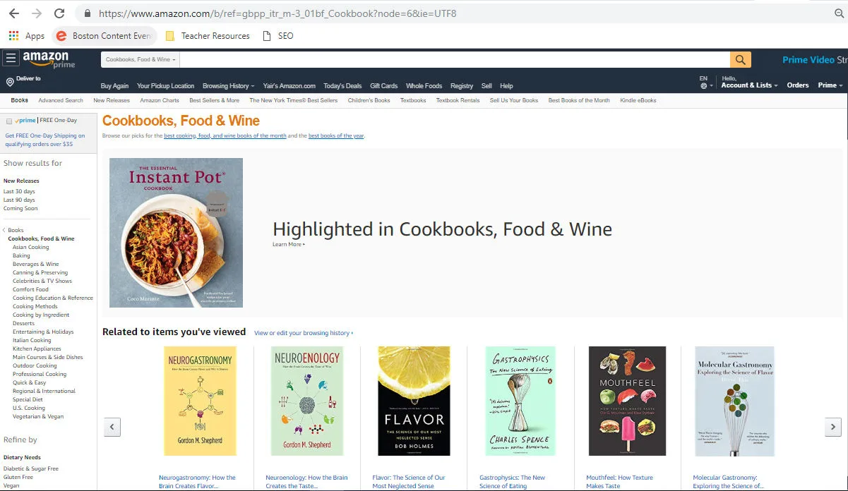
The way products are organized both in the left rail and in the nav bar, and how consumers can filter their search results has become fairly consistent across online stores.
Deviate from that, and you risk losing your audience.
Likewise, placing your checkout button anywhere but the top right corner could really confuse your buyers. They may start clicking in other places, looking for a way to find their shopping cart, or they may just leave and find the same products elsewhere.
3. They’re Distracted by Something Else
Let’s be honest: Marketing teams and creative teams don’t always see eye to eye on how an ecommerce site should be built. There’s often a tug of war between good UX and what Google prefers in terms of crawlability vs. what’s cool, trendy or pretty in the design world.
You want a slick looking site, of course, but you may be causing unnecessary cognitive stress on your visitors, particularly if you have a lot of interactive features or videos.
The same goes for instant pop ups, or multiple advertised sales on one page. Give people too much to look at, and you risk a high bounce rate.
I have two small boys, so I’m on kids’ clothing sites a lot. I find a lot of them really hard to navigate because of all the distractions.
Take a look at The Children’s Place homepage.
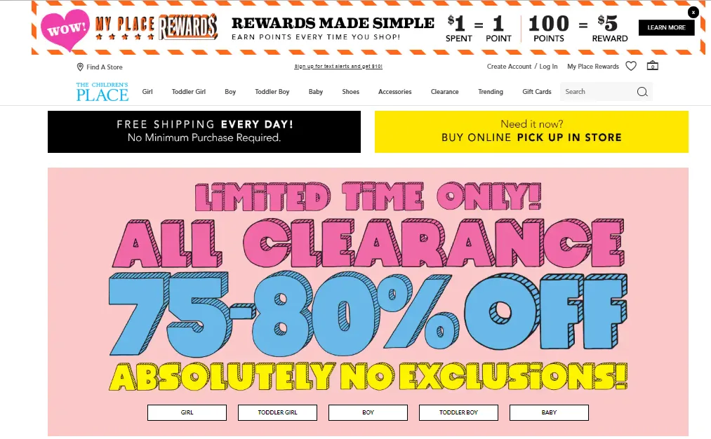
Holy cow! Where do I even start? Should I sign up for rewards? Start shopping for clothes? Click on the free shipping button?
Now take a look at the Gap Kids site.
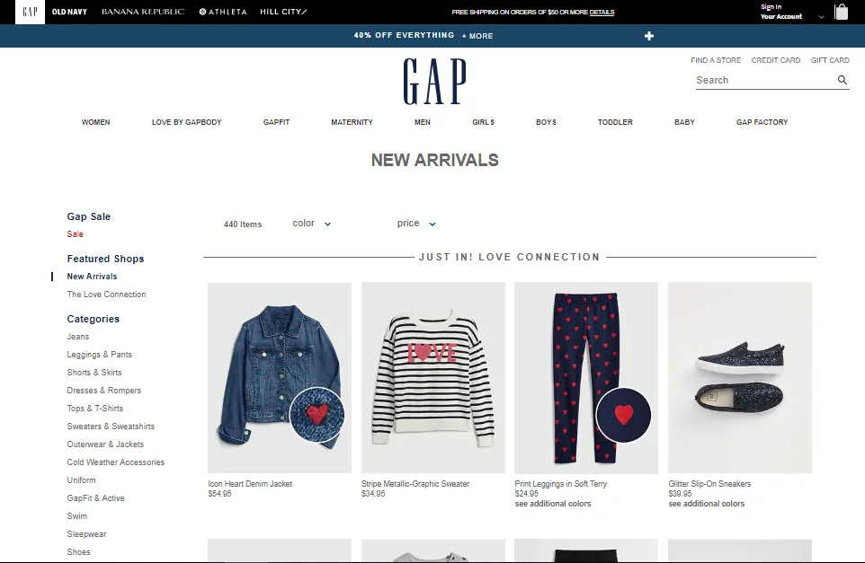
There’s that familiar nav bar and right rail organization we saw on Amazon. Right away, you see the new arrivals. And there is a sale banner, but you only get the essential information until you expand the banner.
Simple. No distractions.
And, by the way, if I want to shop for myself after I shop for the boys, the women’s section is right below the logo.
Here’s another very simple, clean design that makes navigation a breeze:
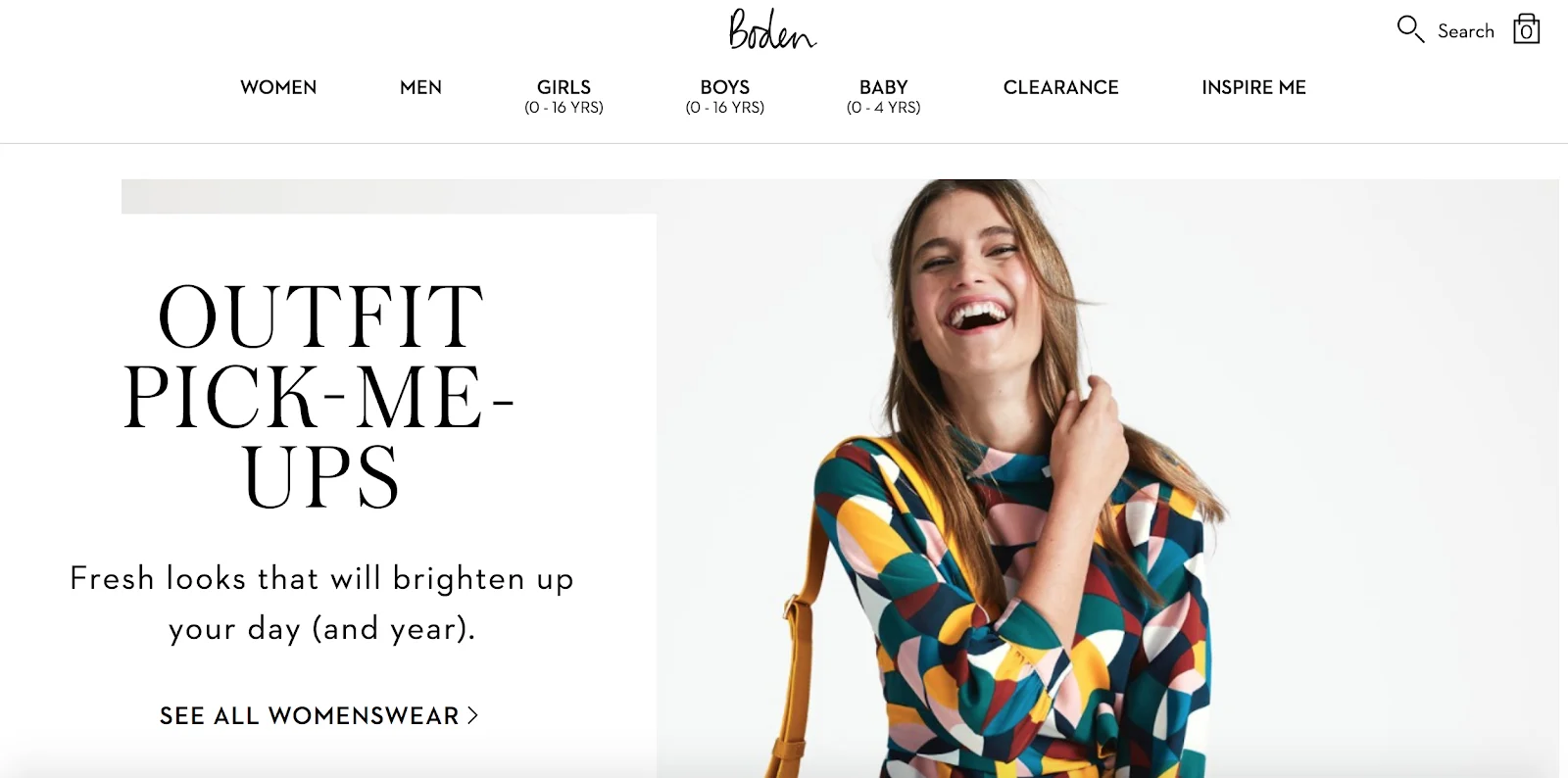
Boden keeps its filters simple so you know just where to go as a shopper to find what you’re looking for.
4. They’re Not Engaged
Why might you be losing the interest of your audience?
Your Content Doesn’t Apply To Them
Most website visitors stay on a page for less than 15 seconds. That’s how much time you’ve got to engage them.
A high bounce rate is an indicator that your audience may not find your content useful. They’re leaving quickly, most likely before they see your CTA. The same is probably true if you’re seeing a small amount of pages per visit.
If your visitors aren’t engaged in this way, you probably need to take a look at your marketing personas. Do they have enough detail? Did you go beyond your typical demographics and include psychographics? Did you address the pain points of your target audiences?
Having detailed marketing personas, rather than a list of demographics, will help you create a framework for your topic and keyword research, and it will help you write better content that talks to your audience rather than at them.
Take a look at the kinds of content your competitors are creating, too. What are their top-rated content and landing pages? How are they engaging their audience and how can you do one better?
Are there other angles to cover? Is there a gap in their content (or in yours) that you can fill?
Your CTAs Aren’t Front and Center
If your audience isn’t clicking through to other pages, particularly your product or checkout pages, you can test moving your CTA up, making it more prominent on the page, or simplifying your design to get rid of distractions, as I discussed earlier.
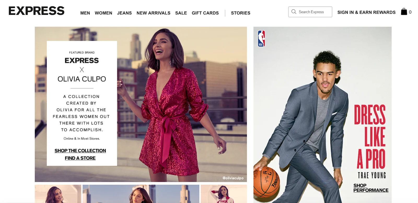
Express is a great example. Before you even scroll down, there are two CTAs (“Shop Performance” and “Shop the Collection”) that allow you to dive right in and start shopping by persona, placed above the fold on a plain white background.
There’s No One There to Help Them
If you don’t have it already, you may want to consider adding a live chat or chat bot function to your site. Live chat, for example, can improve the customer experience by providing answers and solutions in real time.
In fact, it improves conversions by 20 percent, according to ProProfs Chat.
Choosing between live chat or chat bots is up to you, but placing it on your site can help improve your conversion rate by giving potential customers an immediate resource for questions and concerns.
You have options when it comes to the appearance and location of your chat tool. Some sites choose a pop-up that appears in the left or right rail, and then minimize to a sticky icon.
Toys R Us uses this method, reducing the chat bot to a Messenger icon in the bottom right of the screen. Note the personalized suggestion for where you can find the nearest store! The bot is providing value before you even contact it.

5. They Hit a Dead End
Broken links, or static elements that look like they should be links can really stop a visitor in their tracks.
They make for a bad user experience, causing visitors to bounce.
There are several tools and plugins, like Ahrefs, that can help you eliminate dead ends. I use a Google Chrome extension called Link Checker. It color codes your links to help you find invalid ones.
Some people may be getting stuck on static elements, like images or graphics, that they think are clickable.
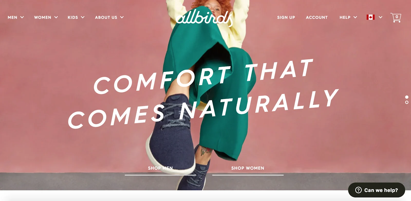
For example, this full-bleed image from Allbirds looks like it should take you to a product page, but clicking on it doesn’t lead you anywhere:
If you find that conversions are down on a particular page, running a heat map or watching a recording of a real customer getting stuck will help you understand why.
If people are clicking on static elements, that could be an opportunity to add a link to a conversion page.
6. They Feel Misled
If your pricing or product offerings are confusing, people may lose trust in your brand. Not to say you’re intentionally misleading your potential customers. It may be that your copy is just a little complex, or the way you’ve displayed your pricing requires too much mental math.
The best way to find out whether this is the case is to ask! You can always reach out to customers via email or through an online survey on your site, and ask them questions about what you can do to improve their understanding of what you offer.

Gather customer feedback and use it to mock up an alternate pricing or product page. Then A/B test it against your current pages.
If you get more conversions from the newer pages, you’ve got something to work with and continue tweaking.
7. Your Site Isn’t Optimized for Mobile
In 2018, 52.2 percent of web traffic was through mobile, and that number is expected to keep climbing.
Mobile is surpassing desktop, so much so that in 2018, Google released its Mobile First algorithm. What does this mean? When Google indexes and ranks your site, it will use your mobile version to do so.
You can see, now, how important it is to have a mobile-ready, or at least a responsive site.
If visitors are leaving your site without converting, it could be because their experience with your mobile site makes it difficult.
Your CTA, which shows up front and center on your desktop homepage, could be off-screen on mobile.
Your images could be pushing down text, or your logo could be cut off -- as in the case with Best Buy’s mobile site below:

When you test your site, don’t forget to test your mobile version to make sure people are getting the same usability they get on desktop. That includes not only phones, but tablets.
Conclusion
There’s more to getting people to convert than simply getting them to your site.
You have to guide them toward that conversion, and make it very obvious what you want them to do.
You have to make sure your services, products, and pricing are clear, and align what you offer to your visitors’ pain points.
If you’re seeing low conversions, use this checklist as a diagnostic tool. Odds are one (or even a few) of these seven reasons is to blame.
Guest Author: Laurie Mega is a freelance writer, specializing in content strategy. She spent 12 years in educational publishing before making the leap to digital marketing and publishing. For the past six years she has worked with major brands like Crazy Egg to boost their marketing initiatives.
BigCommerce helps growing businesses, enterprise brands, and everything in-between sell more online.
Start growing your ecommerce business even faster.
High-volume or established business? Request a demo