Watch Our Product Tour
See how BigCommerce helps you build and manage your online store with ease.
- Ecommerce Insights

6 Key Steps to Launch Your Online Store
Explore our Launch Foundations series to get your BigCommerce store up and running quickly.
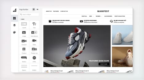
BigCommerce helps growing businesses, enterprise brands, and everything in-between sell more online.
How To Successfully Redesign Your Website
By Raphael Paulin-Daigle, founder of SplitBase.
Have you ever said, or heard someone in your company say this?
“We know our website could be better, so we’re in the process of a complete redesign ”
When I hear this coming from a CEO or a CMO, I can almost guarantee I know why they’re looking to redesign.
More often than not, their sales have hit a plateau, they feel like their website design is outdated, and they believe doing a complete redesign of the website is the solution.
In fact, they believe the redesign will bring in more sales, more revenue, more success.
Unfortunately, website redesigns are highly unlikely to solve the problem.
Redesigns have their place, but they shouldn’t be the default answer to a lack of online sales.
The truth is you can’t be 100% confident that a new website will improve anything. And redesigns are expensive.
For most companies, redesigning a website translates into thousands of dollars and hundred of hours of work.
Outsourcing the work won’t be cheap, and if you have staff to do it internally, the same applies. Initially, the cost of doing the work in-house can be less obvious, but the man hours of your employees will definitely add up. And that’s money – with no guaranteed return on investment (ROI).
Thorren Koomans, director of strategy at a digital web studio, indicates the undertaking of such project usually last up to 6 months or longer.
“Most web projects should allow for 12 to 16 weeks from the time that the project kicks off to the time that the website launches. Where complexity is higher or the scope of the project is particularly large, projects can take 6 months or longer.”
You also have to take into consideration the time and money you will be losing when starting from scratch. If you’ve been A/B testing or optimizing, what you will have learnt about your current design may become useless...
Can you imagine spending thousands of dollars, having meeting after meeting, working on a website for months, and producing a website that’s performing worse than the site you are replacing?
It happens, and here’s how you and your company can avoid this expensive mistake:
Determine the Real Need for a Complete Redesign
Before you act on the default decision of redesigning your website because it “feels” like you need to, identify the real reasons behind it.
For example, is your website REALLY outdated to the the point that it looks like it was designed more than a decade ago? Is your bounce rate always 65%+, your conversion rates are all under 1%, and the experience is confusing?
If not, could a few changes and improvements be a better solution?
If your sales are low compared to the traffic you’re getting your design may not even be at fault… Instead, what about your offer? Your website and copy? The images you use? The calls to action you have?
It’s important to look at your metrics and find strategies to improve them instead of jumping ahead with a redesign. A redesign might be necessary if the majority of your metrics including conversion rates and bounce rates are underperforming, and despite your best efforts at improving, nothing moves the needle.
If nothing improves no matter what you do, you may have hit what we call the Local Maximum. This is when you’ve run multiple A/B tests, iterated, and improved the website but the needle no longer moves. In this case, a more drastic redesign might be required.
That being said, don’t confuse a lack of results from your optimization efforts with having reached local maxima. A lack of a conversion optimization framework, testing the wrong things, or improper A/B testing is usually at fault when companies aren’t seeing results from conversion optimization.
Eliminate Gut Feelings and Opinions
If you move ahead with a redesign, don’t design for design awards and awes, design for usability and conversions. Design for growth.
In order to do this you have to sway away from any gut feelings, preferences or HIPPOS (highest paid person’s opinions). A redesign should be fully data-driven.
A successful redesign will follow the behaviors, needs and wants of your visitors, and in order to determine this you’ll have to spend time analyzing your analytics, and surveying visitors and customers.
This means you probably don’t want to give carte blanche to your designer
Designers are artists, they make things pretty. But when it comes to optimizing your website for conversions, that’s science.
Few designers focus on how to design for conversions. More often than not, it’s the digital marketer’s job to analyze data, create A/B tests and perform website improvements to increase conversions.
If you want to build a high-performing new website, let’s take a step back and look at a key component of high-performing websites: design should support your content. Your content shouldn’t be molded to your design.
Copy, like your product descriptions and value proposition can directly educate and convince visitors to buy your product. You could have a white page, and with good copywriting chances are you will sell something.
Now let’s flip it: Have a nice, pretty, interactive page. Something most designers would love to have in their portfolio. But omit the content and the copy. Where’s the substance?
Visual design is only a piece of your website’s UX.
Design by itself accomplishes nothing.
If you use design strategically to augment the meaning of your content, it can be immensely powerful and influence user behaviors.
Don’t get me wrong. Design IS important. It can help create trust, it can communicate emotions, it establishes your brand’s identity and helps people focus on the right things.
But very few designers can accomplish this by themselves. A highly converting landing page will likely be the result of a great designer, working with a great copywriter and a marketer.
These are all skillsets that are entirely different, but also complementary. Designers, copywriters and marketers have to work together.
“Designing a flow is a lot like writing a story — an interactive story. And to tell a compelling story, it helps to have a writer in the room.
In product design, a writer becomes the narrator of your story, guiding the main character (your user) from scene to scene, screen by screen.”
John Saito, UX writing at Dropbox
Identify your goals
This is one of the most important steps, but also one that’s often forgotten.
Before you even start thinking about how your new website should look, you need to understand what needs to be most improved on your website. This means fully understanding where your users get stuck on the website. For some companies, having people complete the checkout process is their biggest challenge. For others, they need to get a higher percentage of visitors to add an item to their cart.
In order to find out what you should improve, you should start with Google Analytics. Data analysis is a skill to master, and a whole book can be written on it. But here are a few reports that can help you get started:
Assuming you’re using Enhanced Ecommerce (which you should), take a look at the Checkout Behavior report. This report breaks down your checkout steps into a funnel that makes it easy to spot where in your checkout process people are dropping off.
In the screenshot below for example, Step 1 loses more than 50% of visitors. These are people that aren’t proceeding to the next step. At that point, you can safely determine this step is a problem area and you should analyze session recordings and do some user testing to better understand what’s happening.
Steps that are further in the funnel such as step 4 are also prime areas for optimization. In this case, 23.95% are abandoning this final step. So imagine if you reduce drop-offs by just 5%, at this last stage of checkout, that automatically means you’ll get 5% more sales.
Another useful analytics report to look at is the Site Search report that can be found under Behavior -> Site Search. Using this report, you will be able to find out what your visitors are searching for.
This is useful because if a large portion of your visitors are searching for a particular product, it could mean that they have a hard time finding it. In this case, you’d probably want to test displaying this product in more visible area of your site, making it easier to find.
Alternatively, your visitors might search for things you don’t even sell. If it’s a product you don’t carry, and if it makes sense for your store, it may be a good idea to bring in this product. If they’re searching for an answer, make sure to address the question clearly so they don’t have to search. Countering their objections and answering your visitors’ doubts and questions helps tremendously when trying to increase your online sales.
A third report to check out is the Exit Pages report (that can be found under Behavior, Site Content, Exit Page). Use it to understand on which pages people are leaving your website. Begin by looking at your top 10 exit pages. If your cart, checkout, contact pages, or other pages that are vital to your website’s goals are in there, it can signal a potential issue.
Why are people leaving your site on these pages? What can you do to reduce this? This report is a great first piece of the puzzle.
Make sure to identify your KPIs, target metrics, and your key segments. Avinash Kaushik’s analytics measurement plan is a great way to start mapping out what you want to achieve and how you’re going to measure it.
By focusing on improvingyour goals, it will be easier to create hypotheses of potential solutions to test in order to improve your target metrics.
Aim for Evolutionary Redesign
You’re coming to the conclusion a redesign of your website might not be necessary, but yet, you still need to improve it somehow as you're not seeing the results you should be. What do you do? Enter evolutionary redesign...
Instead of doing a one-time, major redesign, evolutionary redesign is about gradually implementing and A/B testing changes to your existing website and design. Change after change, you discard what leads to a decrease in conversions, and keep what produces an increase.
Adobe once explained how they approach their website redesigns and avoid falling in traps like the ones I described above (biases, opinions, and new designs that lead to no results). Not only do they say they always start by planning their redesigns 6 to 12 months ahead of the expected launch, but they also state that “testing like crazy” is key.
“We test every little thing that’s working and not working now as well as every little thing we’d like to incorporate in the future.” – John Fuhriman, Adobe
When you’re gradually testing changes you intend to make to the website, you can build a website that’s fully backed by data instead of gut feelings. One that’s proven to produce results. This means you won’t spend thousands of dollars and hours “guessing” every element on a new design, only to end up with negative results.
For example, one of our recent clients, Primal Pit Paste, asked us to help them increase their website conversions at the same time as they were redesigning the website due to a platform switch.
Instead of waiting for the redesign to be complete before we started optimizing, we suggested that we progressively improve the existing website, do research on their customer’s behaviors, and use our learnings from the research to help them create the new website - instead of starting from scratch.
Over the course of the 6 months, we were able to identify exactly what worked and what didn’t on their website. We tested elements we wanted to add to the new ecommerce web design, and tested all along.
The results? They were able to increase sales by 21%. A drastic improvement considering it would have been easier to redesign without optimizing and testing, like most companies do. But of course, that would mean their sales may have dropped instead. The easiest way to do things is not always the answer.
Amazon and Google are prime examples of this concept. If you look at the design of their websites 10 years ago, not much has changed. Their design has evolved to keep up with the times, but it has evolved gradually with elements that were tested one after another.
Conclusion
Website redesigns can be a huge, unnecessary mistake if they are not truly needed, if they are focused solely on the visual design, and the process is guided by gut feelings.
Instead, focus on making gradual improvements to your website that are backed by insights from your analytics and customer research. Use A/B testing to identify the winning changes to implement.
Evolutionary redesign is about efficiency. It enables you to improve faster than the traditional one-lump way of redesigning websites, and it guarantees your website will convert and deliver results for your company.
BigCommerce helps growing businesses, enterprise brands, and everything in-between sell more online.
Start growing your ecommerce business even faster.
High-volume or established business? Request a demo