


Written by
Sydney Bonner01/23/2026

Ecommerce Landing Pages in 2026 (Tips + Examples)
Get The Print Version
Tired of scrolling? Download a PDF version for easier offline reading and sharing with coworkers.
A link to download the PDF will arrive in your inbox shortly.
Key highlights:
Turn clicks into customers fast. Ecommerce landing pages strip away distractions and focus on one goal: conversion.
Meet shoppers where they are. From visitors to new audiences, targeted landing pages get shoppers what they need, fast.
Make paid traffic work harder. Campaign-specific landing pages boost ROI by delivering on the promise of your ads — no dead ends, no wasted spend.
Test, learn, and optimize with confidence. Landing pages are built for experimentation, making A/B testing easy and insights instantly actionable.
Build pages that look great and convert. Clean layouts, high-quality visuals, and mobile-first design not only perform, but stand out.
Online shoppers are on a mission. They click-through with purpose, expecting to land somewhere that immediately understands what they want. When that doesn’t happen — poof — they are suddenly off to the next page.
An ecommerce landing page is your chance to connect with shoppers around the world. It differs from a homepage, or a product catalog. It’s a focused experience built around a single idea, the right audience, and it’s the best way they can take action.
That focus matters more than ever. With ad prices rising and more competition at every click, brands can’t afford to waste traffic. Every visitor should feel like they’ve landed in the right place, whether they’re discovering your brand for the first time or returning to shop.
When ecommerce landing pages are crafted with intention, they don’t feel forced or overly sales-heavy. They feel helpful. They guide shoppers, build trust quickly, and make the next step easy. In today’s ecommerce landscape, clarity is what turns attention into action and clicks into customers.

There's a lot to love ❤️
Watch a demo to see the BigCommerce platform in action.
What is an ecommerce landing page?
An ecommerce landing page is a standalone web page created specifically for marketing purposes. This is the page a visitor “lands” on when they click on a link, such as an advertisement on Google or promotion in an email campaign.
Ecommerce landing pages are centered around a clear objective of getting potential customers to complete a set goal. For ecommerce and online stores, this is primarily making a purchase.
The page is personalized to match the buyer’s intent and encourages customers with a straightforward call to action (CTA). Page content includes engaging headlines, high quality images, concise copy, and social proof elements like customer testimonials and customer reviews.
Let’s use a hypothetical scenario to provide more context on the purpose and functionality of ecommerce websites.
A shopper might have an upcoming trip and would like to purchase new luggage, so they search on Google for “Best Luggage for Travel.” In the search results, they click-through on a link with the title “The Perfect Luggage for the Modern Traveler.”
When they land on the page, they see a headline that matches this ad and images of modern suitcases. There’s also a CTA button offering a promo code for a 30% discount.
The page also includes subheadings that emphasize the suitcase’s durability, a money back guarantee, and testimonials from existing customers.
In this scenario, the shopper finds exactly what they’re looking for in seconds. The messaging above-the-fold aligns with their intent and buyer persona, the social proof builds confidence, and the offer removes hesitation — making the next click seamless.
That’s the power of a well-built landing page: turning interest into action, and visitors into customers.
The difference between landing pages and product pages
Before getting to the ins and outs of ecommerce landing pages, it’s important to know how these pages differ from other pages on your site, and the impact they can have on your conversion rate optimization (CRO) efforts.
Most times when visitors come to your site, they will land on the homepage or a product landing page. This might be great for introducing visitors to your brand or providing product information. However, these pages don’t necessarily elicit action.
In fact, industry benchmarks show that nearly half of ecommerce visitors leave after viewing a single page, highlighting how easily shoppers disengage when pages aren’t built around a clear, focused goal.
Why?
Because landing pages are designed and optimized for conversion goals.
Product pages are more for informing, while landing pages are for converting. As a result, each page uses different elements to help achieve their intent.
Here’s an overview of the differences between product pages and landing pages.

Landing Pages:
Contains only one clear CTA
Removes additional pathways such as site navigation
Content is written around one goal, for targeted audiences
Includes product descriptions (again, written for specific audiences)
Optimized for marketing campaigns, not necessarily SEO

Product Pages:
Contains a clear CTA, but can include multiple CTAs
Features additional pathways, such as site navigation and product categories
General content that is written for the masses
Includes product descriptions and product recommendations
Optimized for SEO to attract organic traffic
Let’s use the example from above to illustrate the difference between product pages and landing pages.
If the shopper’s search for “Best Luggage for Travel” takes them to a product page, they will see general product information for one suitcase and a button to buy. There’s also site navigation with links to categories like “Laptop Cases” and “Handbags,” and links to other recommended products.
In comparison, if the search takes them to a landing page, they will see a message about modern, durable suitcases and a single CTA button for a 30% discount off their purchase. There is no site navigation, and it does not feature other products that the site offers.
Using this example, both have a CTA that encourages customers to make a purchase.
However, the product page is more general. It acts as an introduction to the site and offers paths for visitors to explore. There are multiple CTAs, in the case that some customers might not be ready to buy on the spot but want to see more and compare their options.
Meanwhile, the landing page has only one message and one CTA. The message is directly tied to the search terms, so the customer’s intent is met when they land on the page. The offer is also directly related to this message, and there is a clear path to achieve the conversion goal without distraction.
Despite the differences, both product pages and landing pages are necessary for your site. They simply serve different purposes when it comes to your overall marketing efforts. Below we’ll discuss the importance of landing pages and why you need them for your ecommerce website.
Find your favorite features.
Explore all of the capabilities of the BigCommerce platform.
Why landing pages matter in ecommerce
Ecommerce landing pages are a key part of the sales funnel.
It is the link between when a customer first sees your ad campaigns, to when they go to your online store and close the deal with a purchase.
Beyond that, effective landing pages can be beneficial to other aspects of your overall marketing efforts.
Here are four reasons why you need landing pages for your ecommerce site.
Drive higher ROI for paid traffic.
Your ecommerce site could have the best online advertising. You could master PPC campaigns with sky high click-through rates, and dominate email marketing with strong open rates.
But if your leads never convert, what’s the point?
Those visitors who come from paid traffic have a certain set of expectations when they land on your ecommerce site. There’s already a set intention, and they want to click on something related to their search.
By having landing pages built to marketing campaigns, you can meet these expectations, and as a result, you can drive higher ROI for paid traffic.
If someone searches and clicks on an ad for “Winter Jacket” then is taken to a homepage featuring other clothing products, they will likely bounce. This paid ad didn’t direct them to what they were looking for, and they didn’t want to take the time searching a site.
If the ad takes them to a page featuring this season’s winter jackets and a CTA to buy, there’s a better chance they will stay on your site and make a purchase.
In other words, you won’t be wasting ad spend.
Great for testing.
Since landing pages are designed for specific marketing initiatives, this is a great opportunity to try new things and see what’s the best way to reach audiences.
A/B test your landing pages to see what works and what doesn’t work. Compare what CTA buttons get the most clicks, what special offers get visitors to buy on the spot, and even what color text appeals more.
Not only does this help determine what landing pages are converting best, the insights from A/B testing can be applied in your other marketing efforts.
For example, if a landing page for a specific campaign has a high bounce rate, it may not be a PPC campaign worth pursuing. Or, if a landing page template with Image A tested better than a landing page with Image B, then Image A is likely a better asset to use in social media promotions.
Target niche audiences.
By having several personalized landing pages, you can better target specific customers.
Design your landing pages to match specific customer segments. What aesthetic appeals most? What value propositions do they need? What CTA triggers a response?
Everything from the headline, images, and even the CTA button text should fit the buyer persona. For example, a landing page template for an email campaign targeting Gen Z should be optimized for mobile devices since that is the preferred device for that segment.
The better you can connect with potential customers, the more likely they are to stay on your site and click your CTA.
Seamless and easy to build.
The thought of setting up several landing pages, each personalized to marketing campaigns and specific customers, might sound like an overwhelming amount of work.
But it doesn’t have to be. Using a landing page builder, you can easily customize different elements of your page. You can also use premade themed templates that take the hassle out of designing pages from scratch.
The payoff is worth it. That’s because the more landing pages you have, the better. In fact, Hubspot found that having 10-15 landing pages can increase your leads by 55%.
Four types of landing page strategies
Not only should landing pages be personalized to fit the visitor’s interests, they should also fit where they are in the sales funnel. Landing pages for first-time visitors who are simply exploring will be dramatically different from those who have already been on your site and started shopping.
This means using different landing pages for different marketing campaigns including awareness, remarketing, upsell, and re-engagement campaigns.
Each of these types of ecommerce landing pages will be centered around a unique objective, ranging from boosting brand awareness to encouraging customers to make another purchase. As a result, the content will vary — especially the CTA.
Here’s a breakdown of the four types of ecommerce landing pages.
1. Top of funnel landing page.
Top of the funnel landing pages will be for introducing your ecommerce site to new visitors.
This page will be used for lookalike campaigns, with audiences similar to your existing customers. These are visitors who may not know about your brand yet, but it’s likely that they will be interested in your products.
As this is your first impression, this page could include content like:
Your brand story and why you exist
Solutions your products offer
Social proof to establish credibility
Consider which details are the most important to convey in the hero section, and strategize the hierarchy of the rest of your information to easily flow down the rest of the page.
At this stage, visitors are likely not ready to buy, so the CTA should focus on making a connection and lead generation. For example, offering a 10% discount on their first purchase when they sign up for your newsletter.
Now, they have an incentive to come back and you’ll have their email address to reach them again without having to use ad spend.
2. Mid-funnel landing page.
Mid-funnel landing pages are for those customers who have shown interest in your site but have not yet converted.
This page will be for retargeting campaigns. These visitors will be familiar with your brand, maybe even have a few items picked out, but could still use some extra convincing.
Content on this page should be focused on giving that little nudge that converts those who are on the fence. This can include:
Content around specific products (i.e. a headline like “If you can’t stop thinking about it, buy it”)
Social proof to show who else has bought the product and positive reviews, like sense of urgency or limited time offers (i.e. “Almost Gone”)
This type of landing page will have a CTA that drives a purchase. For example, having a button with the text “Buy Now.” This makes the path to purchase quick and convenient, encouraging the buyer to checkout right away.
3. Bottom-funnel landing page.
Bottom-funnel landing pages are designed for the customers who have been on your site, added everything they want to a shopping cart, but stopped short of hitting buy.
This page is for upselling campaigns, as customers are already in a buying mindset, and there is an opportunity to offer them additional products.
Upselling content should tell customers not only to buy, but to buy more. This includes:
Bundle offers (i.e. “Complete your order with….”)
Content around related-products (i.e. “Frequently Bought Together” items)
A discount related to cart abandonment, such as free shipping
This page’s CTA focuses on closing the deal first. Then, if possible, see if you can push additional products with a higher-average order value. For example, a CTA saying “Make Your Order Complete” with content specifically promoting bundles related to the customer’s abandoned cart.
Note: It’s best to test the upsell first, then move into offering discounts.
4. Already-purchased landing page.
Already purchased landing pages aim to keep your existing customers happy and coming back to your site.
This page is used for re-engagement and retention campaigns for increasing customer lifetime loyalty (LTV), and repeat purchases (retention).
Since the content for this page is targeting existing customers, you don’t need to go into detail about who you are and what you offer. Instead, focus on content that ensures your customers stay customers. This includes:
Customer loyalty incentives (i.e. Earn points on every purchase)
Sneak previews to new products
Early access to sales or exclusive deals
Category pages related to previous purchases
Opportunities for customer referrals (i.e. Invite your friends and get rewarded)
Unlike other stages of the sales funnel, the CTA focuses on the customer experience. It’s less about getting customers to make a purchase right away, and more about building a strong, lasting relationship.
Make customers feel valued and special. For example, give existing customers access to a sale before it is available to the general public with the CTA that says, “Start shopping early.”
Landing page best practices
Every page you create will be unique to specific ad campaigns, customer segments, and sales funnels. But there are some best practices that have proved to be effective for ecommerce landing pages across the board.
Here are the must-try best practices:
Limit the clutter.
A great landing page with high-quality web design is straightforward and easy to follow. This means limiting the clutter in the overall user experience.
You don’t want to lose a conversion because the visitor was overwhelmed by too much text, or getting lost trying to find the “Buy now” button.
Some tips for limiting the clutter include:
A bold, simple header
Concise, to-the-point headlines
Visible and clear CTA (more below)
Removing site navigation links
Paying attention to white space
Relevant, high-quality product images
Bullet points for product details
Keep in mind that it takes only seconds for a visitor to decide to stay on your site or bounce. This means it’s unlikely they’ll sit and read everything on the page, especially if there’s a lot of text.
It’s more likely that they will skim the page and see if it fits what they were looking for. That means every page element matters and should have a clear purpose for why it’s being included.
Avoid the fluff, don’t add content or pop-ups just because. Stick to the value proposition.
Include a visible, clear CTA.
Visitors should know as soon as they land on your page what your offer is and how they can take advantage of it.
To accomplish this, include a visible, clear CTA.
Unlike other pages on your site, landing pages should only have one CTA. Giving visitors only one choice makes their decision much easier, opposed to having to analyze and choose among several options. This advances visitors into the sales funnel more quickly and without distractions, making it ideal for conversions.
The CTA should be displayed prominently, be easily accessible, and targeted to specific customers. This can be done by:
Placing your CTA at the top of the page, above the digital fold
Including multiple buttons for a single CTA throughout the page
Using active voice for button text (i.e. Sign up for free)
Create a sense of urgency or exclusivity (i.e. Claim your offer now)
Like we mentioned before, landing pages are great for testing. This is especially true for your CTA. Even the slightest changes can make a difference. Regularly test different CTA elements such as button text, button placement, and button color, etc.
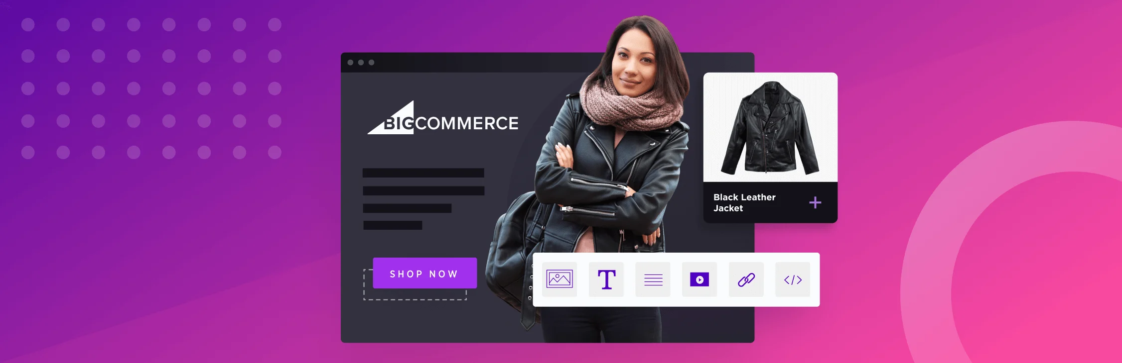
Use high-quality images.
With the limited time and space you have on landing pages to convince visitors, images matter. After all, a picture is worth a thousand words, right?
Use high-quality images that fit with the landing page objective. For instance, if the page is focused around mid-funnel campaigns for specific items, it would be useful to leverage product images.
Be sure that images are optimized for all devices. Especially mobile, which is becoming increasingly popular for ecommerce transactions. Images should fit nicely on the phone without needing to zoom out or scroll down.
Not only do images add a visual appeal, it also plays a vital role in building trust in credibility. Some ways you can leverage social proof through images includes:
Testimonials that include customer photos
User-generated content of customers using products
Media recognition and trust seals (i.e. As featured in….)
Endorsements with pictures of the celebrity or influencer
Only use images that will enhance your landing page. Low quality product images that are pixelated, have poor lighting, or don’t fit with the content are better left off.
Use social media to build trust and momentum.
Elements like customer reviews pulled from social platforms, user-generated content, influencer mentions, or social follower counts show shoppers that real people are engaging with your brand. This validation can reduce hesitation and build confidence for first-time visitors while keeping the focus on conversion. When used thoughtfully, social media content adds authenticity without distracting from the primary goal, helping landing pages feel more trustworthy, relevant, and human.
Here are ways to implement this on your landing page:
Show customer reviews or testimonials pulled from social platforms to build instant trust
Feature user-generated content, such as photos or videos of customers using your products
Highlight influencer or creator mentions that align with your brand and audience
Display social proof signals like follower counts or community size where relevant
Include subtle “as seen on” or media mentions sourced from social channels
Align landing page visuals and messaging with active social campaigns for a cohesive experience
5 examples of high-converting landing pages
With all the different elements, there’s no exact science for what makes the best ecommerce landing page. So, as we’ve said throughout this article, it’s best to always try and test to see what will grab visitors’ attention and convert.
If you’re needing some inspiration to start, we’re here to help. We’ve gathered and reviewed high-converting ecommerce landing pages examples. Let’s take a look.

1. Uplift Desk.
This webpage is visually polished and clearly structured, leading with a strong value proposition around customization, quality, and ergonomics. Product options are easy to explore, messaging is benefit-driven, and trust is reinforced throughout the experience — making it simple for visitors to move from consideration to purchase with confidence. Read the case study here.
What works:
Clear, benefit-led headlines that quickly communicate value
Strong product visuals that showcase customization options and use cases
Prominent calls to action that remain visible as users scroll
Social proof and credibility signals that build trust early
A clean, well-organized layout that keeps the buying journey focused and intuitive

2. Mountain Crest Gardens
The structure of the page above-the-fold is calm, organized, and visually driven, making it easy for shoppers to explore plants without feeling overwhelmed. Clear categorization, helpful guidance, and strong imagery work together to build confidence, especially for less experienced buyers, while keeping the path to purchase simple and intuitive.
What works:
Clear product categorization that helps shoppers quickly find the right plants
Educational content that reduces hesitation and supports confident buying decisions
High-quality imagery that shows plants in real-life contexts
Simple, distraction-free layout that keeps focus on product selection
Strong alignment between browsing, learning, and buying moments

3. Savannah Bee Company.
The header immediately catches visitor’s attention with immersive visuals, clear product benefits, and educational cues that help shoppers understand what makes each product special. By pairing strong brand values with a straightforward shopping journey, the page builds confidence while gently guiding visitors toward purchase.
What works:
Beautiful, high-quality imagery that highlights product quality and craftsmanship
Clear benefit-led messaging that explains value without overwhelming
Educational elements that support discovery and informed purchasing
Strong brand storytelling that builds trust and emotional connection
Clean layout and clear calls-to-action that keep the experience focused and shoppable

4. Berlin Packaging.
The B2B-user experience is built for efficiency and clarity, helping buyers quickly navigate a large catalog of packaging solutions with ease. Clear product categorization, strong filtering, and purposeful content guide customers toward the right solution while reinforcing Berlin Packaging’s expertise and scale. The result is a landing experience that supports confident decision-making and repeat purchases. Read more in the case study here.
What works:
Clear product taxonomy and filtering that simplify a large, complex catalog
Strong use of industry-specific language that speaks directly to B2B buyers
Fast, functional layouts designed for efficiency and repeat orders
Helpful content that supports product selection without slowing the journey
Seamless connection between discovery, product detail pages, and checkout

5. Revelry
This website design emphasizes clarity and ease of exploration, helping shoppers quickly find styles, colors, and options that fit their needs. By reducing friction through thoughtful navigation and supportive content, the page creates a calm, confidence-building journey that encourages customers to move forward without hesitation.
What works:
Clear organization by style, color, and occasion to simplify discovery
Tailored messaging for their audience to see, shop, and relate
Visual consistency that helps shoppers compare options easily
A clean, distraction-free layout that keeps focus on product selection
A supportive browsing experience that builds confidence before purchase
The final word
At their best, ecommerce landing pages make shopping feel easy, intuitive, and even enjoyable.
They remove friction, highlight value, and guide customers forward with confidence. That’s no small thing: It’s how brands build trust at scale and turn one-time visits into lasting connections.
When you create your landing page design with intention and lead with empathy, it becomes more than a marketing tool. It becomes an experience customers remember. Moments that feel thoughtful, relevant, and aligned with what shoppers actually need — right when they need it.
That’s where it all comes together. Each refinement brings you closer to a more seamless, customer-first ecommerce experience that evolves with your business.
FAQs about ecommerce landing pages
There are several tools available to help you improve your landing page performance. Tools like Google Analytics give you insight into traffic sources, while Hotjar and Crazy Egg provide heatmaps and session recordings to track how visitors interact with your page. For A/B testing, Optimizely and VWO allow you to experiment with different page elements. You can also use SurveyMonkey to gather customer feedback and make data-driven improvements.
Social proof builds trust and can drive conversion rates. Showcasing customer reviews and star ratings helps new visitors feel more confident about your products. Including testimonials or success stories adds a personal touch. You can also highlight user-generated content like photos or videos of customers using your products, and add trust badges for extra credibility.
Personalizing landing pages by showing different content based on user behavior, location, or browsing history can dramatically improve engagement. Consider segmenting your audience and tailoring messaging, visuals, or offers to their unique preferences for a more customized experience.
Test one element at a time like headlines, CTA copy or placement, imagery, or social proof, and split traffic evenly between variations to isolate what’s driving results. Run tests long enough to collect meaningful data, then use those insights to guide future optimizations. Over time, consistent testing helps you create more effective, customer-first landing pages that convert better with every iteration.
Fast-loading pages keep visitors engaged, reduce bounce rates, and make it easier for shoppers to take action, while slow or unstable pages create friction and erode trust.
Metrics like Largest Contentful Paint, Interaction to Next Paint, and Cumulative Layout Shift help identify where performance issues affect real users, making them essential benchmarks for optimizing landing pages that feel smooth, responsive, and reliable across devices.
By using data like browsing history, referral source, device type, or customer status, you can adjust messaging, promotions, and calls-to-action to better match intent. Returning shoppers might see familiar products or loyalty-focused offers, while first-time visitors are guided with clearer value propositions or introductory incentives.
When customers see content that reflects their interests and stage in the buying journey, the experience feels more relevant, the decision-making process feels easier, and the path to conversion becomes more natural.
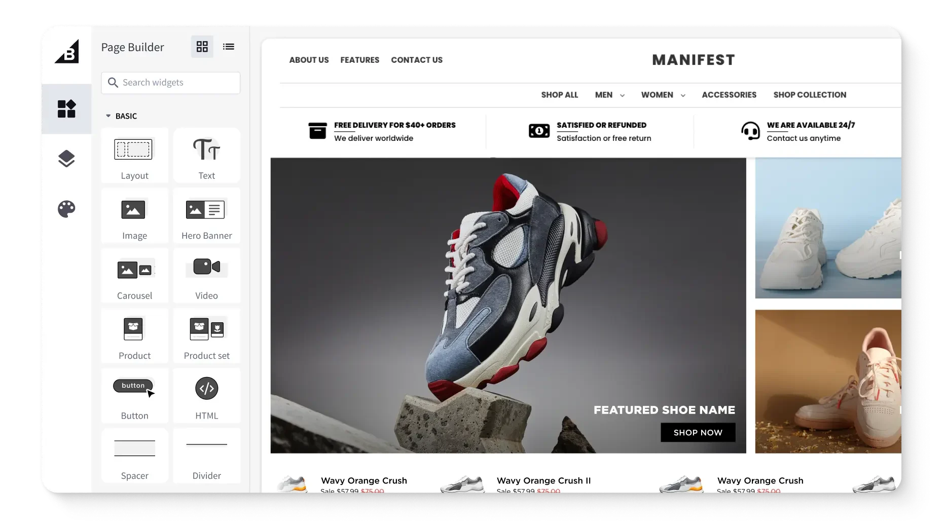
Tools like BigCommerce Page Builder, along with third-party solutions such as Unbounce, Instapage, and Optimizely, allow teams to create, test, and update landing pages quickly without relying on developers.
With visual editors, reusable content blocks, and built-in connections to products, pricing, and promotions, teams can move faster while staying aligned with their broader ecommerce strategy.
These tools make it easy to customize layouts, launch campaigns with confidence, and iterate based on performance insights, all while maintaining brand consistency, operational efficiency, and a seamless shopping experience across every touchpoint.
Ecommerce landing pages should be designed differently for mobile and desktop users because behaviour, screen size, and intent vary significantly by device. Mobile landing pages need to be fast, streamlined, and thumb-friendly, with concise copy, large tap targets, and prominent calls- to-action that are easy to access on smaller screens.
Desktop experiences can support richer content, more detailed imagery, and additional context for comparison or research. Optimising layouts, load speed, and interactions for each device ensures a smoother experience and helps maximise conversions across both mobile devices and desktop.
Get a free 15-day trial of BigCommerce.
No credit cards. No commitment. Explore at your own pace.