- Launch Services
Overview
Chart your path to success with specialized services.Implementation Project Management
Experts to ensure you launch on time and under budget.Solution Architecture
Seasoned advisors to help you best design your store.Data Migration & Optimization
Expertise on a clean and clear path to migrating your data.Enterprise Launch Package
Personal training on how to set up and launch your BigCommerce Store.

Professional Services Blog Series
Get to know our teams and how they support your success in this Q&A series.

The Global B2B Buyer Behavior Report
This in-depth report provides actionable strategies to help you sell more online.
7 Reasons to Consider Mobile-First Ecommerce Site Design

Create your store and start selling today.
Create your new website.
See if the BigCommerce platform is a good fit for your business.
No credit card required.

Written by
Felix Zoot BillsonThese days we do pretty much everything on our phones. We chat with friends on our phones. We video conference our colleagues on our phones via team communication tools. We find our significant others on our phones. We bank on our phones, stream shows on our phones, and we certainly love to shop on our phones.
It’s hardly surprising – did you know that there are a staggering 5.27 billion unique mobile phone users in the world today? In fact, the number keeps growing at a rate of 1.9% per annum. Due to increasing mobile device use globally, more and more of us are choosing to shop from our mobile phones. That’s exactly why mobile ecommerce sites need to be mobile-first.
We live in a time of mobile communications. Whether it’s mobile call forwarding or mobile shopping, today, more than half of all internet traffic is online shopping from a mobile device. Yet, despite this fact, many ecommerce stores still practice desktop-first design with added mobile responsiveness tagged on as a side measure. If so many of us favor mobile devices shouldn’t ecommerce site design start using a mobile-first design model?
That’s the growing consensus amongst many of today’s industry leaders. In this article, we’re going to be discussing everything you need to know about mobile-first design and the seven reasons why every ecommerce site should be adopting this design model in 2021 and beyond.
We’ll be covering:
What percentage of ecommerce is mobile?
What is mobile-first?
7 reasons to consider mobile-first ecommerce site design
Mobile-first ecommerce website best practices
What Percentage of Ecommerce is Mobile?
A growing number of ecommerce transactions are now happening in the palms of our hands. In 2019 mobile ecommerce (or M-Commerce for short) accounted for a significant 67.2% of global ecommerce sales. That’s the equivalent of 2.32 trillion dollars. In fact, by the end of 2021, it is expected that M-commerce will account for a staggering 72.9% of total retail ecommerce across the globe.
But how did this happen? The retail landscape well and truly changed with the rise of the smartphone. Mobile devices have turned ecommerce on its head. Our mobile phones impact not only our shopping behaviors, but our purchasing decisions, and even our brand loyalties. They have a direct impact on what products end up in our shopping cart at the end of the day.
In 2020, approximately 50.88% of all internet traffic globally could be traced back to mobile devices and smartphones. And the gap continues to grow. As of March 2021, mobile increased its market share worldwide to make up 54.22% of all internet traffic.
What is Mobile-First?
So, what exactly is the mobile-first concept? Mobile-first is a concept whereby websites are designed for smartphones first and then scaled up for use on desktops and laptops later.
In other words, web pages are written up in mobile-first CSS and mobile-first HTML coding languages to begin with. That means ecommerce sites can ensure they have beautiful and functional mobile sites that offer user-friendly browsing and payment for their customers.
Traditionally websites have been designed in the reverse direction – for desktop first.
But with mobile-first models, all the initial designing and prototyping is based on mobile functionality first. Larger screens are factored in afterwards. This helps deliver higher quality user experiences to mobile users than have previously been available.
This mobile-first approach forms part of a methodology known as progressive enhancement. Progressive enhancement, as opposed to graceful degradation, proposes that instead of developing all features from the start, websites should be founded upon those features that can be supported by all browser versions. By contrast, a graceful degradation methodology would build an application upon a basis of full functionality then downgrade this enhanced version for different browser versions (e.g. old browsers or, in our case, mobile devices).
The latter method can often result in mobile sites that simply aren’t good enough. That’s why mobile-first designing is now transforming ecommerce with improved mobile experiences that support omnichannel sales. By focusing on mobile first, mobile shoppers benefit from exceptional designs and functionalities both on the small and the big screen.
Mobile-first vs. Mobile-friendly
It’s important to note that mobile-first design is not the same thing as mobile-friendly design. Mobile-friendly (also known as mobile-responsive design) does not start from the smartphone and scale up. In fact, it does the opposite.
Mobile-friendly designs are built on the graceful degradation model. Mobile-friendly designing involves scaling down desktop designs and adapting them for mobile screens. Whilst you might think that mobile-first and mobile-friendly sound not that dissimilar afterall, the end products can vary quite significantly
Mobile friendly designs might work on smartphones, but they are principally geared towards desktop use. The design must be compromised for the small screen. That means that the scaled down mobile version tends to be lower in quality, less intuitive, and usually offers an inferior user experience.
Mobile-first methods benefit online stores in particular, because they consider the needs of mobile users first, and design websites precisely for use on smartphones. Since that’s where most purchases take place, it makes a lot of sense to go mobile-first.
7 Reasons to Consider Mobile-First Ecommerce Site Design
Mobile first design boasts numerous benefits. It’s economical, responsive, and offers exceptional growth potential. Some might say that going mobile-first is the first step towards adopting a customer-first attitude. We all know that a good business is a customer-focussed business. So why aren’t we designing our sites with today’s customers in mind?
Since so many of our customers shop via mobile devices, a mobile-first approach is guaranteed to support increased conversions, and improved experiences. Still not convinced? Here are our top seven reasons to consider mobile-first Ecommerce site design in 2021.
1. Economical Website Design Strategy
Switching to mobile-first site design can save you both time and money. Why? Because mobile-first design is essentially a one-size-fits-all solution to great cross-platform user experiences. For example, instead of creating a beautiful website for desktop then having to adapt it heavily just so that it functions at a basic capacity on mobile, you’ll achieve a user-friendly site for all platforms first time around.
Furthermore, mobile-first design promises to be a great financial investment. We live in an undeniably mobile age where optimized mobile experiences are critical for success. Going mobile-first promises to increase client engagement, and extend your reach over a wider demographic. It is true that mobile-first strategies can be expensive in the short term. But the value added by truly great mobile functionality makes it a solid and cost-effective long-term investment.
2. Cross-platform Responsiveness
A mobile-first website will be compatible with a variety of different platforms. In today’s day and age that’s incredibly important. It means that your users can engage with site content, video marketing, and much more from whichever platform is most convenient to them at the time.
Most people access the internet from more than one device. For example, they might browse on their desktop then complete a payment later on their smartphone. In fact, one survey by GlobalWebIndex found that 95% of respondents used smartphones to access the internet, 93% used desktops, and 73% used tablets. With such high usage rates for all three devices, reliable cross-platform responsiveness is absolutely essential.
3. Better SEO with Mobile-First Indexing
Google has switched to mobile-first indexing. That means that Google uses the mobile version of your site when indexing and ranking content. If you’re already running a site on WordPress or Shopify, for example, Googlebot will now automatically use the mobile version of your site.
Any enterprise marketing agency will tell you, then, that designing mobile-first should be part of any comprehensive search engine optimization strategy. That’s ever more important since three out of every five searches now happen on mobile.
Smartphone usage is on the up and great mobile experiences are essential. By offering higher level mobile experiences, users are more likely to return to your site regularly, improving visibility, relevance, and reach both in the eye of the customer and the search engine.
4. Better Use of Content
Designing for mobile encourages content creators to be more concise – because who wants to be scrolling through pages and pages of lengthy information on a small screen? When sentences are kept short, content becomes more clear, concise, and easier for the reader to digest. Did you know that nearly half of users will stop using a website on a mobile device if they find the content to be useless or the layout overly complicated?
When we design for smaller screens first, we are forced to differentiate between content that is valuable and important, versus content that is glorified filler. When we do this, we also strengthen our brand messaging by picking out content that really tells the customers who we are, what we do, and why they should purchase from us. Remember, you can always scale up your content for the desktop site later on.
5. Add Value to Customer Experience
According to research conducted by PWC, 42% of buyers are willing to pay more for a great customer experience. Today, going mobile-first could be the key to improving customer experiences. Mobile adoption has become a critical part of the customer experience and providing high quality mobile services is key to keeping customers happy.
A bad mobile experience speaks poorly of your brand. In fact, 50% of customers will stop visiting a website if it isn’t mobile friendly. So, what is the best way to add value to your business? By giving customers exactly what they want. Some of the most valuable features for M-commerce shoppers include:
Product images
Accurate product descriptions
Personalized experiences
Easy navigation
Integration with retail locations
Integration with social media
Simple checkout process
Multiple payment options
Great customer service
Security features
6. Higher Growth Potential
Ecommerce has boomed in recent years. But it’s now being taken over by M-commerce. We live in a mobile-first world, so it goes without saying that mobile-first design is the route to higher growth potential. Mobile is starting and ending more consumer journeys, and voice controlled devices are fast becoming a massive driver of sales. In fact, 40% of consumers now use voice technology to make online purchases.
M-commerce is now a major shopping channel. One-click payment options, social-media commerce, and soaring app usage are generating mobile growth potential. And thanks to improved mobile experiences, mobile-commerce is expected to increase in value from $128.4 billion 2019 to a staggering $418.9 billion by 2024 according to Business Insider.
7. Gather Insightful Customer Data
Last but not least, M-commerce is a great way to gather more customer data. The more data you collect, the more you can then use it to offer your customers exactly what they want and need. Collecting customer data improves shopping experiences in the long run. Plus, mobile data collection is a great way to expand your email and SMS marketing lists.
Mobile ecommerce can help companies gather data about user locations, shopping histories, particular interests or even social media profiles. And that, in turn, helps retailers deliver tailored brand messages to their customers and personalized user experiences.
Testing Mobile Commerce Sites
The benefits of a mobile-first approach are many. But when you choose to switch your design model to mobile-first design, it’s still important to conduct all the necessary testing before launching your new platform to paying customers. This will ensure that there are no glitches impacting your platforms user experience and functionality. Types of testing include:
1. Agile testing.
Agile testing is integrated directly into the developmental process. By conducting agile testing, you’ll troubleshoot any bugs or potential problems early and move your new platform forward as quickly and efficiently as possible.
2. Functional testing.
Complementary to this, functional testing focuses on usability and will help you identify whether your site actually works as you intended it to.
3. Manual testing.
When your new mobile site is nearing launch, manual testing is essential. What is manual testing? Manual testing is when human testers check out the quality of your site, and is great for optimizing your interface for real users.
4. Localization testing.
Just like functional testing, localization testing is designed to check if mobile apps and websites offer full functionality for their users. But localization testing zeros in on one particular location. This is especially useful if your site is targeting a particular region.
5. Automated QA testing.
Automated QA testing uses automated testing tools to run tests on your site during development. Unlike manual testing, QA testing relies on specialized tools and frameworks created by testers and tends to be more accurate and time-efficient.
Mobile-First Ecommerce Website Best Practices
1. Give UX the highest priority.
When it comes to M-commerce, UX (user experience) is super important. Complicated pages of content just won’t cut it when it comes to mobile. By offering customers a user-friendly experience, you’ll encourage revisits in the future. Failing to deliver on user experience can be costly and tend to drive away potential buyers, who will most likely seek out your competitors instead. To improve UX focus on simple designs, easy-to-read typefaces, interactive content, and mobile-friendly search functionalities.
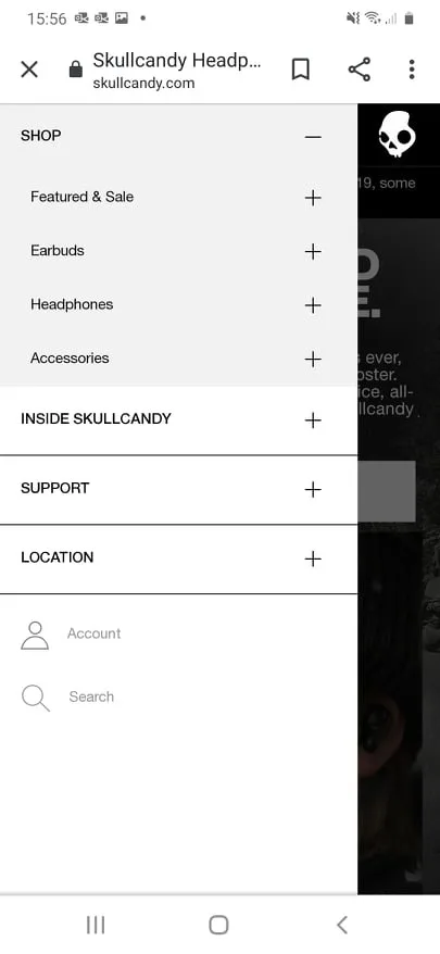
Take a look at Skullcandy’s super simple user navigation template. An A+ for simple UX. The navigation bar is clear and concise, easy to read on mobile devices, and customer support is clearly signposted. Plus, there’s also the option for mobile-friendly search in case a user wants to navigate directly to a particular product or criteria.
2. Establish Visual Hierarchy
Visual hierarchy is simply the practice of arranging design elements according to their importance. By laying out visual elements and navigation icons strategically, designers can encourage users to use the website in the most optimal way and increase conversion rates.
That could mean highlighting a new offer or giving your brand’s social media platforms center stage. It can also mean avoiding unnecessary and distracting popups on your product pages. By contrast, when web pages lack intuitive design, users tend to become confused and quickly lose interest.
The main thing is to keep any important elements – from the checkout to the search bar – within easy reach. Smartphone users are often multitasking whilst using their devices. They could be waiting in line at a cafe, sitting in the parking lot, or waiting for the next train. That’s why it’s so important to establish visual hierarchy.
As a general rule, your mobile homepage should look a little something like this.

As you can see, primary functions are the most accessible, whilst secondary and tertiary functions are arranged around the margins.
3. Keep the site simple.
Simple design is integral for UX. By simplifying designs, adapting images to prioritize load times, and removing excessively long content, you’ll be well on your way to improving your users’ experiences. Aim for a simple and intuitive homepage, product pages, and checkout process. An overly cluttered web page will drive customers away – 89% of people will shop with a competitor after a poor user experience.
The idea is to design primarily for responsiveness. That means being mindful of image sizes, content layout, and video content. Customers want product images but make sure that they are clearly visible on mobile. Ensure that content is arranged for mobile viewing, and ensure both image and video file sizes aren’t jeopardizing your load times. Every second counts in the fight against page abandonment.
Take water bottle retailers Larq, for example. Larq’s web designers have kept things super simple. The most prominent design element on the Larq mobile homepage is a killer USP (“60 seconds to pure water”) and corresponding call to action (CTA) (“Shop now”). Super simple, but super effective.

The Future of Design is Mobile-First
The future of web design isn’t on PC – it’s on your Androids and iPhones. Mobile-first design starts from the smartphone and scales up for the desktop. By flipping the traditional design process on its head, ecommerce merchants can feed into our mobile-first society and the changing consumer habits that are continuing to set a precedent for the future. Going mobile-first offers some tremendous benefits, from heightened customer experiences to increased growth potential. If you’re not already designing mobile-first, it’s time to make the switch.