


Written by
Annie Laukaitis02/09/2026
Key highlights
Great ecommerce website design balances aesthetics, usability and performance to guide shoppers smoothly through the buying journey and drive conversions.
Clear navigation, intuitive layouts and well-structured categories help customers find products quickly and reduce friction.
Mobile-first design and fast loading times are critical as more shoppers browse and buy on smaller screens.
High-performing product pages use strong visuals, detailed information and clear calls to action to build confidence and drive purchases.
Studying real-world ecommerce design examples helps brands apply proven best practices and continuously improve their online experiences.
When it comes to building a great ecommerce website, looks matter — a lot. In fact, 48% of internet users say the design of a site is the most important factor in deciding whether a business is credible. Additionally, 57% say they wouldn’t recommend a company that has a poorly designed website.
That’s why your ecommerce website design needs to do more than just look good. It should be visually engaging, intuitive to navigate, and clearly showcase your brand and products — all while making it easy for shoppers to buy.
Whether you’re an established online business or an aspiring entrepreneur just starting out, your website design plays a critical role in converting traffic and earning customer trust.
In this guide, you’ll get actionable tips and visual inspiration to help you design a high-performing ecommerce storefront. Ready to dive in? See how 18 BigCommerce merchants bring their designs to life across industries like fashion, food and beverage, and health and beauty.
Best practices for creating a memorable ecommerce website design
Ecommerce website design comes in numerous styles and fashions, but many of the best online stores have one thing in common: a top-tier user experience. Below are a few key elements to ensure a memorable customer journey every step of the way.
Showcase your brand.
Your website should be an immediate reflection of who you are as a brand. From your logo and color palette to your tone of voice and product imagery, every design element should work together to create a cohesive identity. Use consistent branding across all pages to build trust and recognition, and don’t be afraid to let your personality shine — whether that’s sleek and modern, bold and playful, or warm and welcoming. A strong, recognizable brand not only captures attention but also keeps customers coming back.
Highlight trust indicators to customers.
Establishing trust is essential for turning browsers into buyers — and your website design plays a big role in that. Clearly display your contact information so customers know how to reach you if they have questions or issues. Reliable customer support, whether through live chat, phone, or email, reinforces confidence in your brand.
Including visible SSL certificates and other security badges in your footer or checkout flow is another simple way to build credibility and reassure shoppers that their data is safe.
Personalize the shopping experience.
In the age of Spotify “For You” playlists and hyper-specific TikTok algorithms, the case for personalization is clear: today’s shoppers expect brands to recognize them.
A memorable ecommerce experience isn’t just about showcasing new products; it's about making each shopper feel like the experience is tailored just for them. Personalization isn’t just a design trend — it’s a cornerstone of any effective marketing strategy.
In addition to using customer data for product recommendations and real-time support, brands can connect shoppers to relevant email marketing flows or engage them through personalized content on social media platforms.
Below we’ve compiled a list of ways you can personalize the shopping experience:
Dynamic content: Tailor target content such as recent views, pop-ups, and exclusive offers based on demographics such as geolocation, device, and past behaviors.
Product recommendations: Incorporate “continuous shopping” recommendations or personalized bestseller lists based on the customer’s past purchases and search history.
Customer profiles and wishlists: Allow customers to save their preferences and previous purchases in order to make future shopping more convenient and seamless.
Chatbots: Bring the in-person shopping experience online with live chat or AI-powered assistance, allowing customers to get real-time support.
Ultimately, personalization helps build loyalty and encourages repeat business. When customers feel understood and seen, they’re more likely to return, recommend your store to others, and become long-term advocates for your brand.
Incorporate customer reviews.
New customers can be skeptics. If they aren’t familiar with your brand or products, they might not yet trust you to deliver on your promise — which is why adding social proof to your website is so important. Especially for startups and small businesses that don’t yet have a large following, featuring customer testimonials, user-generated content, and product reviews on your site is key to providing transparency and building credibility with your target audience.
Why? Because customers trust other shoppers. When other people have a good buying experience on your site, it validates brand value, removes resistance, and encourages potential customers to purchase.
But building customer loyalty can go beyond customer review. Other trust signals such as links to store policies (ex: exchange and return policies), store contact information, and technical certifications can reduce shopping cart abandonment and add an additional layer of transparency to your site.
Simplify the checkout process.
There’s perhaps no experience as vital to the customer journey as checkout. Even the smallest hiccup during the process can turn a sale into a lost customer for life.
Ensure the process is quick and intuitive by minimizing the number of steps required to complete a purchase — or better yet, create an option for one-page checkout. Offer guest checkout options to avoid mandatory account creation, and provide clear progress indicators and calls-to-action to further enhance the experience.
By making the checkout process efficient and hassle-free, you can increase online sales and encourage repeat purchases, ultimately driving the success of your ecommerce business.

Ebook: Win Customers Across Every Channel
Get expert insights on data, branding, and marketing strategies to grow sales on every major ecommerce channel.
Showcase high-quality images and videos.
Especially for businesses selling physical products, site visuals are hugely important. Showcasing high-quality images and videos allows your customers to taste, smell, hear, feel and experience your product before they click “buy.”
Here are some simple ways to create a picture-perfect ecommerce website:
Position product photos against white space to accentuate details.
Incorporate lifestyle photography to help customers visualize how they would use your products in their day-to-day life.
Retouch your photos and videos to allow for color correction, removal of unwanted objects, and adjustments in lighting.
Enhance page load speed.
Time is money, and many shoppers aren’t willing to wait around for an online store that isn’t loading fast enough.
To supercharge your site’s speed, start by optimizing images and videos, which tend to be the most information-heavy item on a page. Resizing images and making sure the images have a low byte size will increase the speed of the page.
Next, implement lazy loading to ensure non-essential resources load only when needed. Trim down heavy scripts and consolidate files to reduce HTTP requests. A Content Delivery Network (CDN) can also turbocharge your content delivery, making your site faster for users around the globe.
Lastly, ensure your website is hosted on a top-notch, speedy server. Regularly test your site’s performance with tools like Google PageSpeed Insights or GTmetrix to identify areas for improvement.
Prioritize a mobile-first design.
Many of us go day-to-day with a mobile device within arm’s reach — and retailers are responding by optimizing content for smaller screens and enabling one-click ordering and other conveniences that support on-the-go shopping. In fact, the share of mobile commerce in all ecommerce has been on the rise, expected to reach 62% in 2027.
First, make sure your ecommerce store has an intuitive, consistent layout across various devices, including desktops, smartphones, and tablets. Especially if you’re launching your store on a new ecommerce solution, make sure it allows for a responsive, user-friendly interface across different devices and screen sizes.
Second, your mobile design should align with your navigation. For instance, if your store has an extensive inventory, you may benefit from a product search with filtering capabilities and a hierarchical product menu.
Lastly, test out your mobile design before launch to confirm screen size adjustments and feature migration. Go through the entire purchase process — landing page to checkout — to make sure you’re happy with the transactional flow.
18 examples of unforgettable ecommerce website designs
Need some real-world inspiration? These 18 standout ecommerce sites, built on BigCommerce, showcase how thoughtful design can elevate the shopping experience, strengthen brand identity, and drive results across a variety of industries.
AS Colour.

AS Colour’s ecommerce design is clean and minimalistic, reflecting the brand’s commitment to high-quality basics. A neutral palette of whites and grays lets the vibrant product photography take center stage, allowing the items to speak for themselves.
With refined typography and a polished layout, the intuitive drop-down navigation clearly organizes product categories, making it easy for customers to browse. The brand’s focus on premium essentials is reinforced through detailed descriptions and close-up imagery that highlight fabric quality and fit.
UPLIFT Desk.
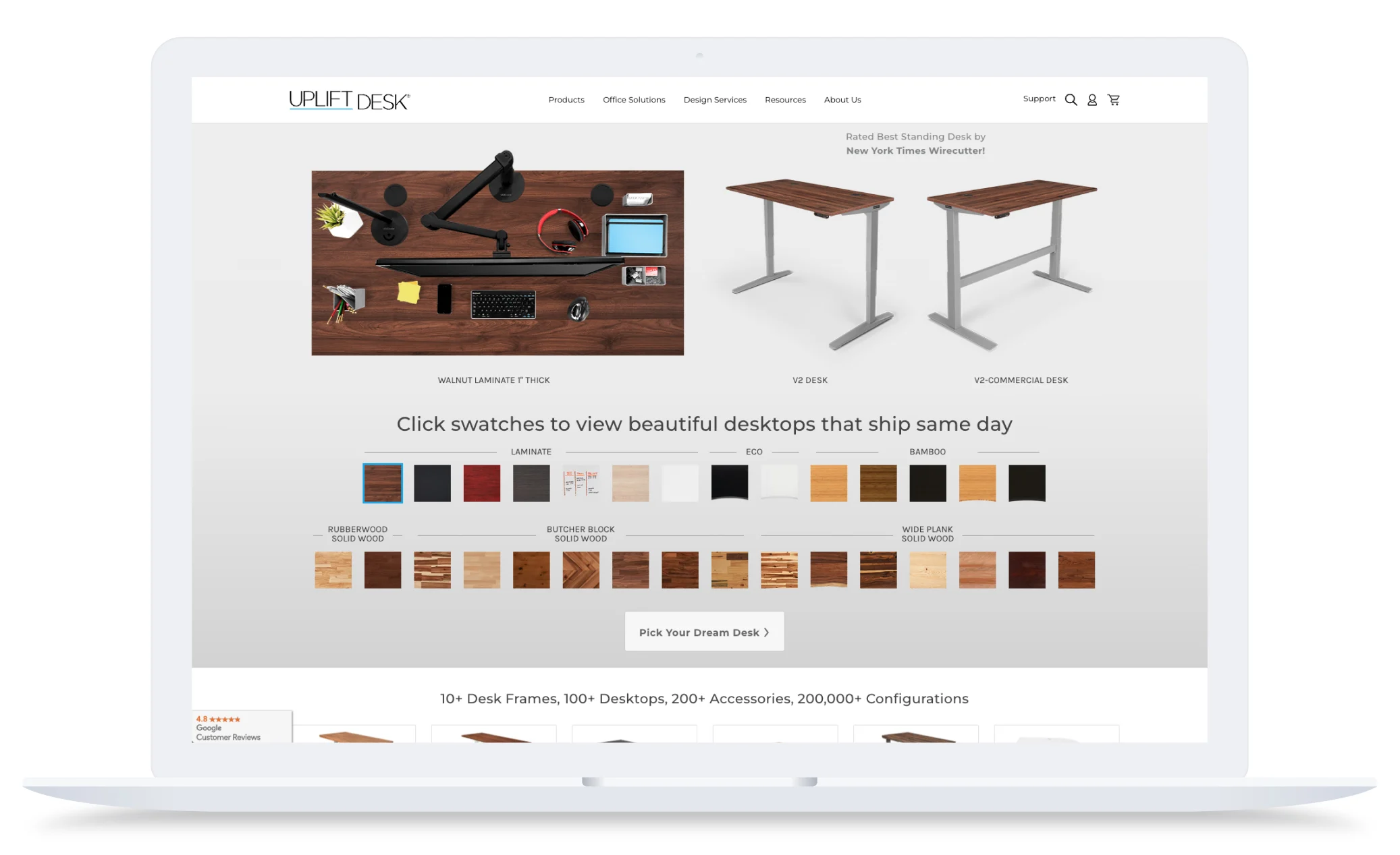
UPLIFT Desk’s ecommerce site design is sleek and modern, aligning with the brand’s focus on ergonomic innovation and workspace wellness. A clean white background paired with bold imagery and pops of blue and black creates a professional yet approachable aesthetic that appeals to both individual and B2B customers.
The brand’s site offers shoppers a unique and memorable experience, allowing them to customize their ideal standing desk upon entry, enforcing the brand’s mission to provide office equipment that improves the lives of each shopper.
Coco Republic.

Coco Republic’s ecommerce site exudes sophistication, mirroring the brand’s reputation for timeless luxury and elevated interior design. With a warm, neutral color palette and elegant fonts, the site creates a high-end showroom feel that invites visitors to explore thoughtfully curated collections.
Navigation is streamlined and intuitive, with product categories organized by room, style, and function — making it easy for shoppers to browse or get inspired. Each product page features crisp imagery, dimensional details, and styled room shots that showcase how each piece fits into a larger design vision. From designer collaborations to customization options, Coco Republic’s website reinforces its position as a leader in premium home furnishings.
Mizuno USA.

Mizuno USA’s ecommerce site combines athletic energy with clean, performance-driven design — perfectly reflecting the brand’s commitment to innovation in sports gear and apparel. A bold mix of black, white, and navy blue sets a dynamic tone, while large action-focused imagery immediately communicates movement, strength, and purpose.
The site’s navigation is tailored to athletes, allowing users to easily shop by sport, collection, or product type. Each product page is packed with detailed specs, sizing guides, and high-resolution images that highlight the technical features Mizuno is known for. With athlete endorsements, customer reviews, and a strong focus on product performance, the site builds trust and inspires confidence in shoppers who demand both quality and results.
Music Direct.

Music Direct’s ecommerce site blends functionality with a deep passion for high-fidelity audio, delivering an experience that resonates with music enthusiasts. A classic black, white, and blue color scheme reflects the brand’s focus on premium sound, while a content-rich layout highlights both expertise and product depth.
The navigation is robust yet user-friendly, allowing shoppers to browse by category, format, brand, or even curated recommendations. Product pages feature detailed specs, expert commentary, and customer reviews — making it easy for audiophiles to evaluate and compare gear. With a strong editorial voice, educational resources, and a curated feel, the brand’s site positions itself as more than a retailer, it’s a destination for those who live and breathe music.
Oroton.

Oroton’s ecommerce site is elegant and refined, mirroring the brand’s heritage in luxury fashion and accessories. With a soft, neutral color palette, generous white space, and graceful typography, the design evokes sophistication while keeping the focus on product imagery and craftsmanship.
Navigation is minimalist yet intuitive, allowing shoppers to explore by category, collection, or occasion. Product pages are visually rich, featuring clean photography, zoom-in details, and styling suggestions that reflect Oroton’s commitment to timeless design and quality materials. From homepage to checkout, the site delivers a premium shopping experience that reinforces the brand’s legacy in Australian fashion.
Chair King Backyard Store.
Case study: Chair King Backyard Store
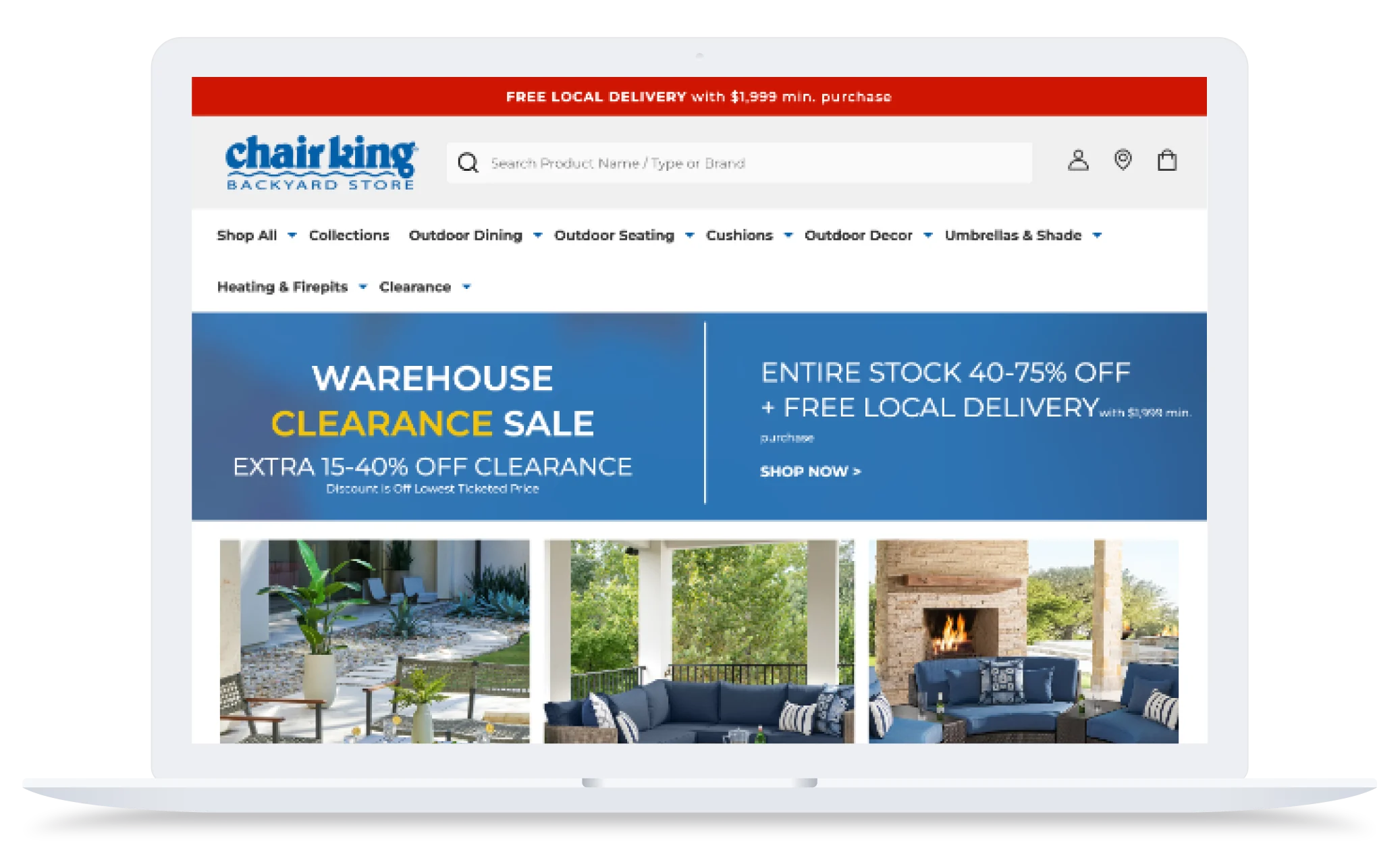
Chair King Backyard Store’s ecommerce site blends high-end functionality with customer-first design, perfectly aligned with the brand’s mission to help shoppers create comfortable, stylish outdoor spaces. The site’s warm color palette and clean layout mirror the inviting, in-store showroom experience, while clear navigation and detailed product pages make it easy for customers to explore collections and visualize furniture in their own backyards.
After evaluating platforms like Shopify and WooCommerce, Chair King ultimately chose BigCommerce for its flexibility and ability to support complex delivery logistics. One standout feature is the brand’s custom shipping calendar at checkout, which allows customers to select from available white-glove delivery dates or opt for local pickup — a must-have for a furniture business with region-specific logistics. With a user-friendly backend, personalized product recommendations, and streamlined content management, Chair King’s site is optimized not only for conversions but also for ease of use by a small, nimble ecommerce team.
Inhaven.
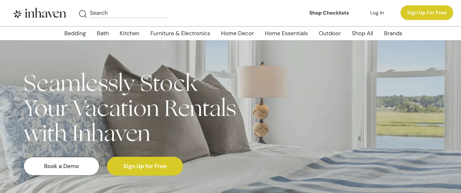
Inhaven’s ecommerce site is clean, intuitive, and purpose-built to meet the unique needs of vacation rental professionals and property managers. A neutral color palette and spacious layout offer a polished, professional feel, while clear navigation and helpful filters make it easy to find everything from bedding and kitchenware to room-specific bundles.
The site goes beyond traditional ecommerce by offering innovative B2B features like customizable checklists that allow users to shop for entire rooms based on budget and quality standards. With over 10,000 SKUs and tailored customer groups, Inhaven also supports bulk purchasing, streamlined reordering, and user-specific access — creating a five-star shopping experience for busy property managers. By combining trusted hospitality-grade products with an efficient, tech-driven interface, Inhaven is redefining how the industry sources and stocks vacation rentals.
The Linz Shop.
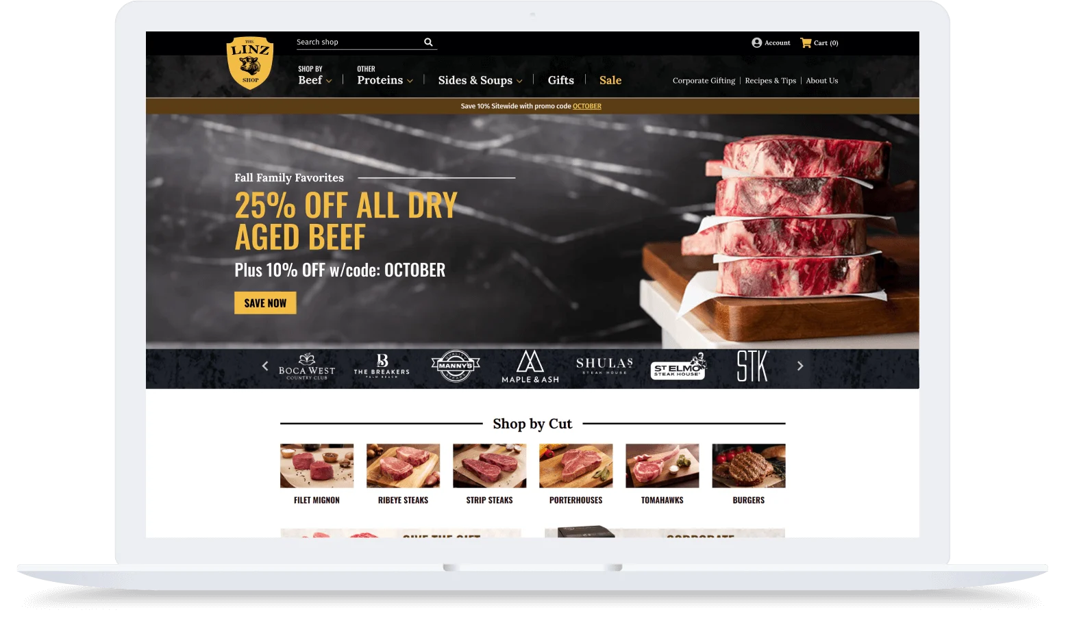
The Linz Shop’s ecommerce site brings the craftsmanship of a fourth-generation butcher to the digital table with a sleek, modern design that reflects the brand’s premium quality and deep culinary roots. Featuring bold photography of perfectly marbled steaks and chef-level cuts, the site immediately immerses visitors in an upscale yet approachable shopping experience.
Navigation is simple and shopper-friendly, with products organized by cut, type, and curated collections like steak boxes and gifts. Behind the scenes, powerful customizations — including an ERP integration, tailored shipping calendar, and advanced checkout logic — ensure that customers receive fresh orders exactly when they need them. Designed with both food lovers and gifting in mind, The Linz Shop successfully translates its in-store legacy into an ecommerce experience that’s fast, intuitive, and deliciously effective.
Walton’s.
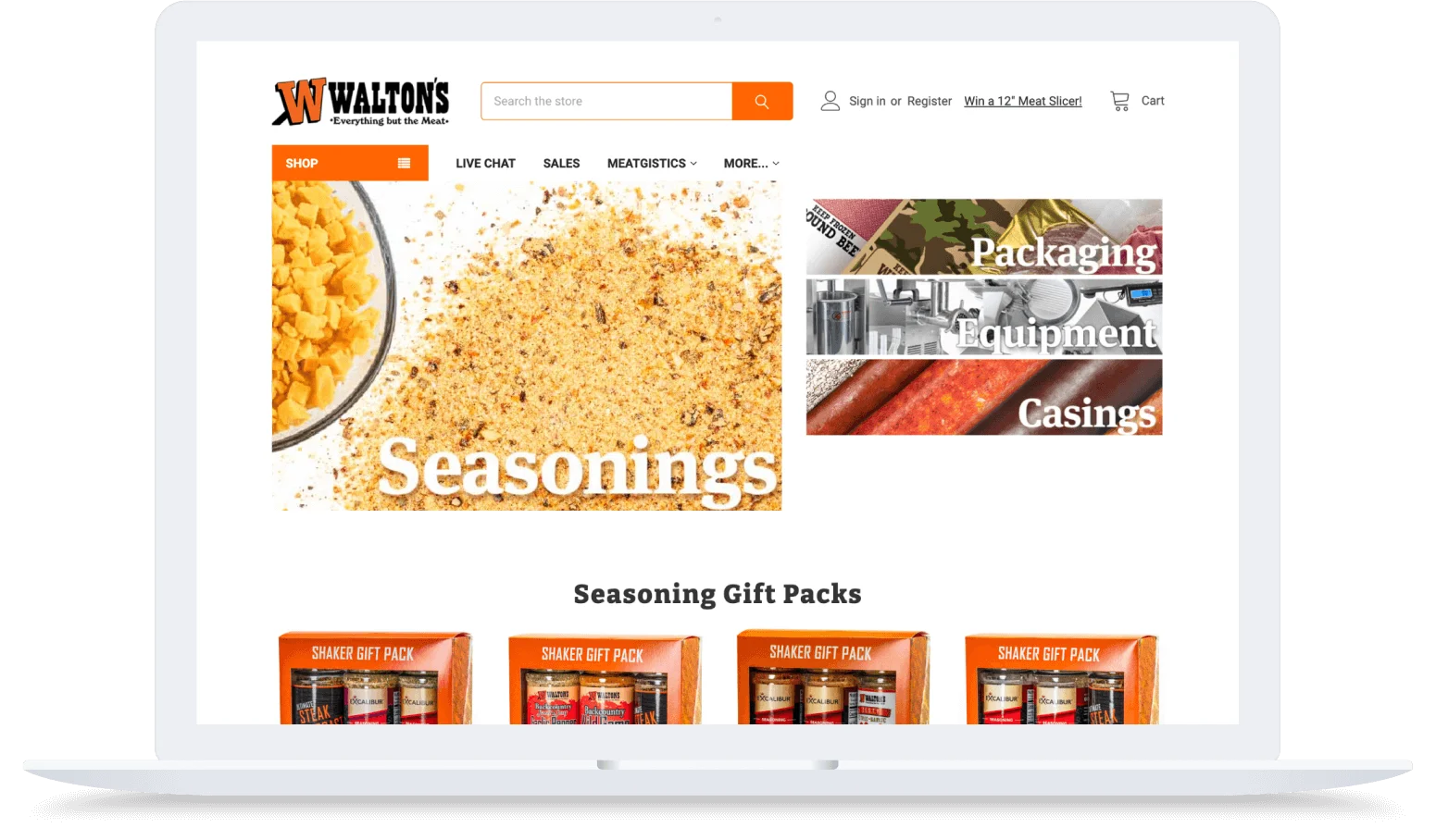
Walton’s ecommerce site blends functionality with tradition, delivering a robust, informative experience that caters to both commercial processors and home meat enthusiasts. The design is practical and product-focused, with a clean layout, bold category navigation, and helpful educational content that highlights the brand’s deep expertise in meat processing.
Built to serve both B2B and retail customers, the site makes it easy to browse a wide inventory — from heavy-duty equipment to spices, casings, and DIY kits — all while providing features like customer-specific pricing, grouped order histories, and seamless ERP integration. With tools like Shogun for custom pages and a thriving online community (Meatgistics) woven into the experience, Walton’s proves that legacy, innovation, and ecommerce can thrive together on a single, customer-first platform.
OK4WD.
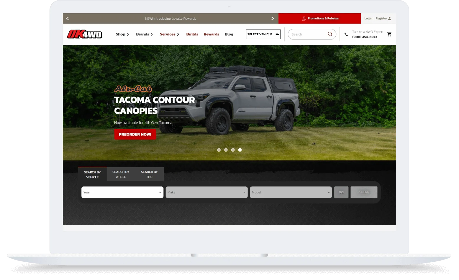
OK4WD’s ecommerce site is rugged, efficient, and built for explorers — just like the vehicles they support. With a clean, utilitarian layout and bold product imagery, the site delivers a no-frills experience that’s easy to navigate for both B2B buyers and everyday off-road enthusiasts.
During their replatforming process, OK4WD evaluated both Shopify and BigCommerce — ultimately choosing BigCommerce for its more robust B2B capabilities and greater flexibility. Shoppers can explore a massive product catalog with ease, thanks to smart filters, categorized navigation, and seamless integrations with tools like ShipperHQ and Klaviyo.
On the backend, OK4WD uses BigCommerce’s B2B Edition to streamline wholesale ordering, automate purchase approvals, and give customers 24/7 access to invoices, payments, and order tracking. With these upgrades, the brand has nearly doubled its conversion rate while saving dozens of hours each week in manual processing — proof that OK4WD’s online experience is as finely tuned as the vehicles its customers depend on.
Kaiser Willys.

Kaiser Willys’ ecommerce site is a treasure trove for vintage Jeep and Willys enthusiasts, pairing a rugged aesthetic with highly functional design to support a passionate niche audience. The homepage and navigation reflect the brand’s restoration roots, while features like “Shop by Diagram” deliver a uniquely intuitive online shopping experience tailored to DIY mechanics and collectors.
With tens of thousands of hard-to-find parts in its catalog, the site’s advanced search functionality, powered by Klevu, helps users zero in on exactly what they need, while keyword merchandising and promotional banners guide them toward timely deals and relevant categories. Thanks to a composable BigCommerce setup and expert implementation from agency partners, Kaiser Willys has seen measurable increases in both conversions and revenue — proving that even legacy brands can thrive with the right digital strategy.
HairStore.FR.
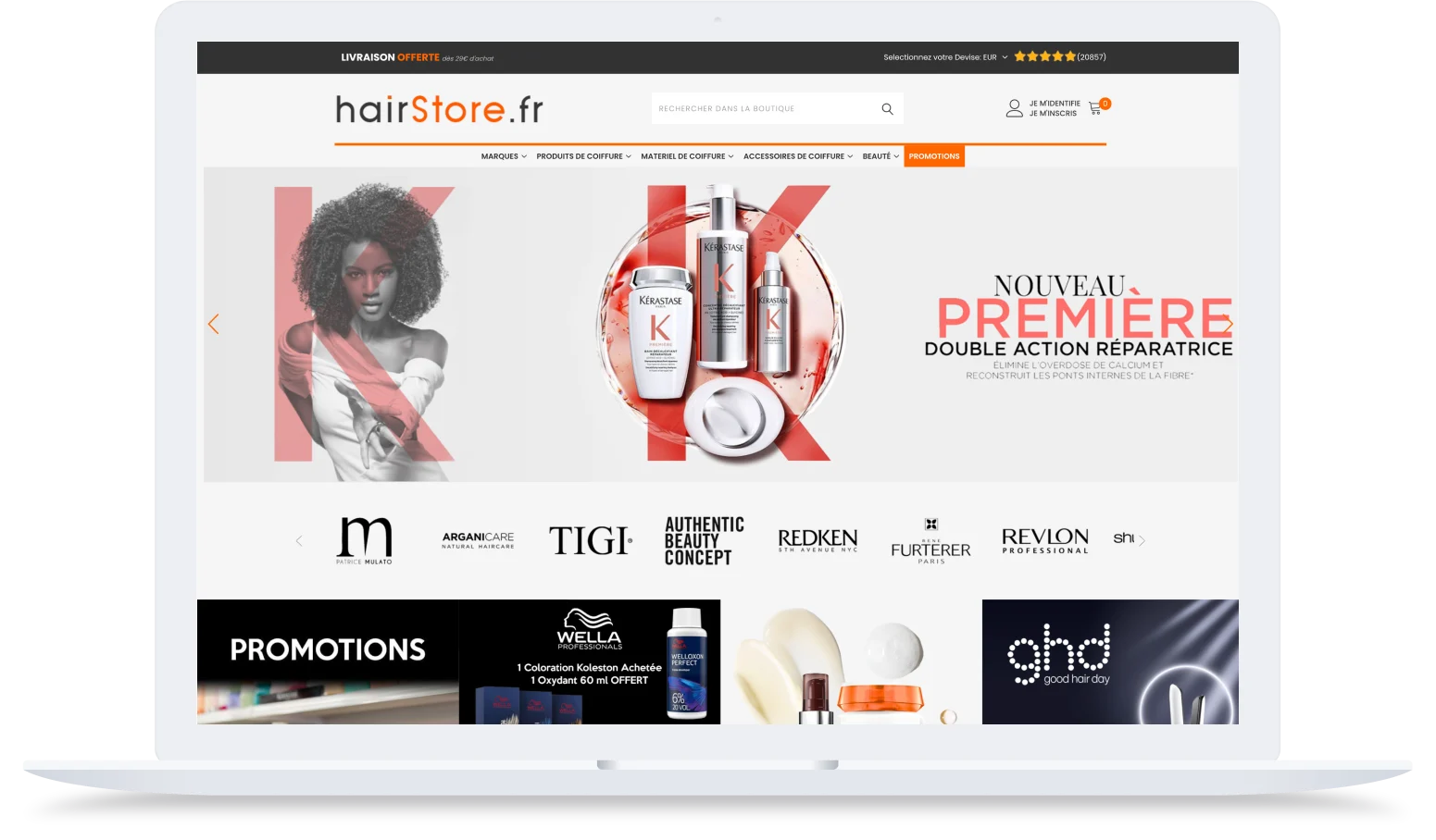
HairStore.fr’s ecommerce site pairs sleek design with elevated usability, creating a polished shopping experience for both beauty professionals and everyday consumers. A clean, modern layout and strategic use of imagery mirror the visual standards seen in other high-end skincare and cosmetics brands.
Designed with speed and simplicity in mind, the site features intuitive navigation and a mobile-friendly interface that makes browsing seamless across devices. With fast load times and consistent visual styling, HairStore.fr reflects the brand’s commitment to innovation — all while setting the stage for future personalization and international expansion.
MitoQ.

On the cutting edge of science, health, and technology, MitoQ has created an online store that reflects its product offering. Featuring a clean, modern aesthetic with a calming color palette of blue and red gradients, the site conveys the same sense of health and vitality that the brand offers its customers. Through educational resources, interactive design elements, scientific studies, and customer testimonials, the site encourages learning and exploration, fostering a sense of trust and credibility to its brand.
Cordova Outdoors.
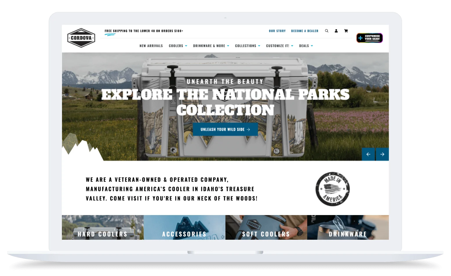
Cordova Outdoors’ ecommerce site is bold, rugged, and built for adventure — perfectly aligned with its line of American-made, high-performance coolers and outdoor gear. With a sleek, headless design powered by BigCommerce, the site offers a seamless, responsive experience that’s as tough and streamlined as the products themselves.
From customizable drinkware to logo-ready hard coolers, Cordova makes it easy for customers to personalize their gear using an interactive design tool powered by Customily. The site is packed with modern ecommerce features, including flexible payment options, automated marketing via Klaviyo and Attentive, and detailed analytics, all working together to support both DTC and B2B growth. Backed by a small but mighty team and a powerful platform, Cordova Outdoors is scaling fast without compromising the customer experience.
Combat Corner.
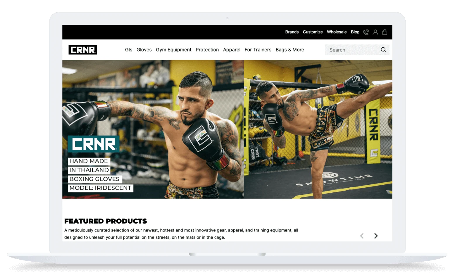
Since implementing a headless architecture with BigCommerce, Combat Corner has found the freedom and flexibility to enhance its customer experience. With a significantly improved page load speed, the martial arts equipment manufacturer has further enhanced the user experience for both desktop and mobile shoppers.
In addition, the company has taken advantage of BigCommerce’s B2B features, including customer groups and price lists, allowing customers to shop the site based on their specific customer group. Through these functions, items that are most applicable to the business’s selected group are featured, and special discounts or pricing are automatically applied.
Toolden.
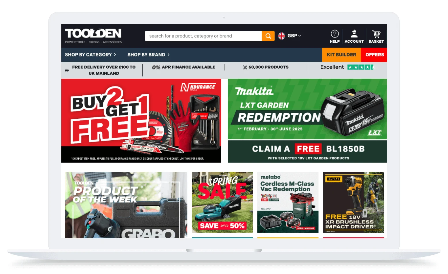
Toolden’s ecommerce site is a powerhouse of scale and speed, combining intuitive design with enterprise-grade functionality to serve both professional tradespeople and DIY shoppers. With a bold, utilitarian aesthetic and easy-to-navigate structure, the site reflects the brand’s roots in reliability and its ambition for global reach.
Built on BigCommerce and powered by B2B Edition, the site supports custom pricing, credit limits, and individualized trade accounts — streamlining the experience for business buyers. Behind the scenes, Toolden leverages a flexible tech stack and API-powered integrations to scale fast, listing tens of thousands of products in minutes. With explosive revenue growth, a new physical store on the horizon, and a commitment to customer-centric innovation, Toolden’s digital presence is as durable and dynamic as the tools it sells.
TradeTools.

TradeTools’ ecommerce site blends industrial strength with ease of use, offering a streamlined, customer-first experience that supports both tradespeople and DIY shoppers. With a headless architecture and rugged yet clean design, the site reflects the brand’s focus on durability, performance, and service.
Powered by BigCommerce, TradeTools benefits from flexible tools like native price lists and a simplified one-page checkout — features that enhance the customer journey while minimizing internal overhead. Strategic integrations with platforms like ShipperHQ, Signifyd, and Printout Designer automate freight, fraud prevention, and order fulfillment, helping the team work smarter at scale.
Advantages of using BigCommerce for designing a site
Customize without limits.
In order to design your site the way you want, you’ll first need an ecommerce website builder that gives you the freedom to do so.
Unlike open-source platforms like WordPress, which often require complex web development and ongoing maintenance, BigCommerce provides merchants with a powerful foundation for customization.
With access to pre-built website templates and a full suite of marketing tools, you can bring your storefront vision to life without relying on developers — unless you want to.
We provide the core elements for launching and scaling an ecommerce operation — such as design templates, catalog management, hosting, checkout, order management, reporting, and pre-integration into third-party services like payments, shipping, and accounting — as well as an open API architecture that allows merchants to fully customize every aspect of their online experience, including checkout experience, themes, payment gateways, price lists, B2B features, and more.
While BigCommerce offers many ecommerce features out-of-the-box, the platform also has a robust app store filled with both free and paid apps and plug-ins designed to help your business grow. With a wide range of third-party apps catering to various aspects of ecommerce, including marketing, order management, and customer engagement, merchants have the freedom to choose from best-in-breed solutions that best suit their business.
You can also connect your site to a branded custom domain or purchase a new domain name directly through your ecommerce platform — helping establish trust, improve SEO, and reinforce brand recognition from the very first click.
Unlike marketplaces such as Etsy and eBay, where branding and layout are restricted, BigCommerce gives you full creative control to craft a site that’s uniquely your own.
Launch your site with ease.
Creating a compelling, interactive ecommerce website design doesn’t need to be complex. But the downside of many open source solutions is that most features and integrations must be built from scratch — which often means less control for marketing and business users.
However, BigCommerce makes it easy to get your online store up and running quickly, with out-of-the-box functionality and over 600 pre-built integrations to save time and money. In addition, both business users and technical users alike can easily and cost effectively make site changes on the fly.
With BigCommerce’s intuitive drag-and-drop Page Builder, users can easily launch their storefront, manage page content, and design a beautiful, custom site without relying on coding or developers. The Page Builder allows you to easily add widgets and blocks of content such as text, images, banners, videos, and buttons to your storefront pages, or choose from our library of widgets or create your own.
Close the sale with flexible payment options.
For many customers, the best checkout experiences are the ones that offer flexible payment options. In fact, 10% of customers will abandon their carts if they don’t see enough payment methods available.
Beyond traditional options like credit cards, BigCommerce allows merchants to provide other sales and payment processing options such as digital wallets and accelerated payment methods such as PayPal, Stripe, and Amazon Pay. In fact, BigCommerce merchants can choose from more than 65 pre-integrated online payment options, serving 230 countries and over 140 currencies.
BigCommerce also offers a number of financing options, including Buy Now, Pay Later (BNPL). Leveraging our open, multi-location inventory APIs, you can connect your brick-and-mortar stores with your online storefronts. By partnering with providers such as Klarna, Sezzle, and Affirm, BigCommerce merchants can encourage online shoppers to pay in installments without any added interest — leading to higher conversion rates, average order values, and sales.
Rest assured with industry-leading performance and security.
As your trusted ecommerce partner, BigCommerce takes care of platform updates, security patches and hosting, and every BigCommerce store is PCI DSS 4.1 Level 1 compliant to protect against data theft and fraud. This gives non-technical merchants the ability to move quickly and scale their business rather than worry about the upkeep of their website.
When it comes to maintaining your ecommerce store, some other ecommerce platforms may require a heavy dependence on designers and developers as well as expensive maintenance and support, which can make it difficult to calculate your total cost of ownership.
Merchants using BigCommerce never have to worry about staying up to date and keeping their site secure. Since updates happen automatically and the platform includes industry certifications like PCI DSS and SSL, it’s no surprise BigCommerce is consistently rated as one of the best ecommerce platforms for growing brands.
For more information on how to complete a successful platform migration and start designing your new and improved ecommerce store on BigCommerce, check out our Replatforming Guide.

⏰ Isn't about time that you evaluated your ecommerce platform?
Request a demo to see how the BigCommerce platform is different.
The final word
Creating a memorable ecommerce web design is about more than just aesthetics — it’s about building a seamless, user-centric experience that earns trust, drives conversions, and keeps customers coming back. Every element, from fast page load times and intuitive navigation to compelling visuals and personalized content, plays a vital role in how shoppers engage with your brand.
As the ecommerce landscape continues to evolve, your website design should do more than follow best practices — it should reflect your unique identity and support your long-term business goals. By leveraging the tips in this guide and drawing inspiration from the real-world examples shared above, you’ll be well on your way to designing a storefront that not only looks great, but performs even better.
Check out our Case Study page to discover more examples of brands who are building unforgettable ecommerce website designs on BigCommerce.
FAQs about ecommerce website design
Most ecommerce websites are built on specialized ecommerce platforms that combine storefront design tools with built-in selling functionality. Common platforms include:
BigCommerce
Shopify
WooCommerce (WordPress)
Adobe Commerce (Magento)
Squarespace
Wix
Salesforce Commerce Cloud
commercetools
Custom-built solutions
These platforms provide customizable themes, flexible design frameworks and developer tools that allow designers to create branded storefronts. They also support essential ecommerce functionality, including product management, checkout, payments and order processing.
Accessibility ensures your site works for all users, including those with disabilities. Follow Web Content Accessibility Guidelines (WCAG) by adding alt text to images, using strong color contrast, and enabling keyboard navigation to enhance usability.
An accessible website improves user experience, boosts SEO, and fosters customer loyalty. Designing with inclusivity in mind benefits both your shoppers and your business.
Ecommerce businesses can use analytics to track and understand user behavior, identify popular pages, and see where users drop off in their shopping journey. This data can help businesses to optimize site layout, improve navigation, and enhance the overall user experience to boost conversions. For example, data might reveal that a significant portion of users drop off at a particular stage of the checkout process, prompting design adjustments to streamline that step and reduce friction.
A/B testing on ecommerce websites involves testing variations of elements such as page layout, CTAs, or product descriptions to determine which version performs better in achieving specific goals, such as increasing click-through rates or reducing bounce rates. When performing A/B testing, make sure you define clear hypotheses, test one variable at a time, ensure statistically significant sample sizes, and interpret results to iteratively improve site design and user experience.
Choosing an ecommerce platform can significantly impact your website design capabilities, user experience, and overall performance, depending on the platform’s native capabilities and customizability. A robust platform should offer customization options to reflect brand identity, support responsive design for mobile optimization, integrate with third-party tools for enhanced functionality, and ensure scalability and security.
Schedule a demo with one of our ecommerce experts to learn how BigCommerce can support you in your ecommerce design journey.
Each category and product page should have an SEO-friendly description that includes your keywords. Not only does optimizing your search bar, categories, and navigation menu help customers find your products, but it also improves search rankings.
Personalizing the shopping experience can have a significant positive impact on customer satisfaction and loyalty. You can achieve this by leveraging dynamic content specifically tailored to your customers’ demographics and incorporating personalized product recommendations based on previous purchases or even favorited or wish-listed items.
Additionally, you can have features on your ecommerce website such as allowing your customers to create profiles and wish lists as well as implementing chatbots to provide real-time assistance. All these strategies help create a shopping experience that will feel unique to each of your customers, increasing the likelihood of return visits and purchases.
Mobile-first design is an integral part of not only ecommerce design best practices but also of overall website design. Optimizing your ecommerce website for mobile ensures a consistent user experience across all devices and, with search engines focusing on mobile performance, can also impact your search results appearances.
Key strategies for great mobile performance include having responsive design, aligning navigation with mobile usability, as well as testing the entire purchase experience on mobile to confirm seamless functionality. By prioritizing mobile design, you can cater to a growing number of mobile shoppers and improve overall user engagement and conversion rates.
High-quality images and videos are essential for ecommerce websites because they allow your customers to visually experience your products before making a purchase. These should have white space to highlight details, include lifestyle photography to showcase the products in real-life settings, and be carefully retouched for better color accuracy and lighting. Having excellent visuals can significantly enhance the overall shopping experience, making your customers more confident in their purchases and reducing the likelihood of returns.

Find your favorite features.
Explore all of the capabilities of the BigCommerce platform.