


The BigCommerce Blog
Actionable insights to help you stay on the cutting edge of ecommerce.
Choose your area of interest

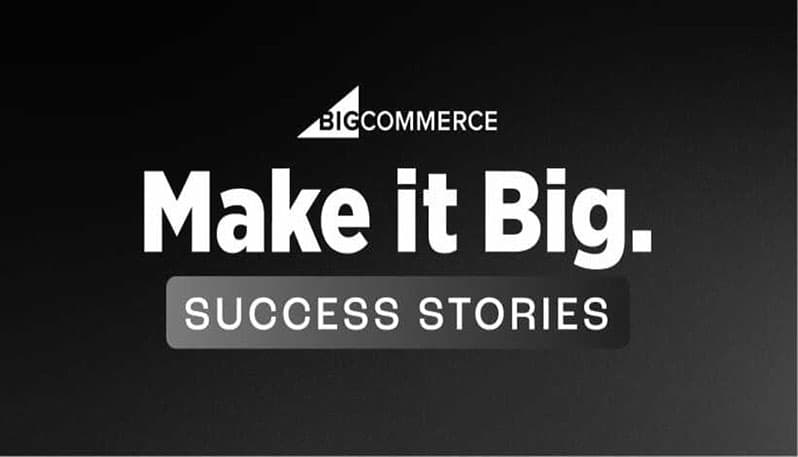
Customer Success Stories
Hear from real BigCommerce customers about their success on our platform.


Developer Resources
Get updates on our codebase and ways that you can customize your storefront.

BigCommerce Community
Explore our most recent presentations and podcasts with ecommerce leaders.

Holiday Commerce
It's that special time of year. Make the most of it with our yearly holiday tips!